Let's talk
We can't wait to hear allabout your plans.
We can't wait to hear all
about your plans.
Come visit us if you are
in town,
drop us a line to
or call us anytime


More info
Year
2023
Location
Lloseta, Mallorca
Typology
Singular housing
Developer
Christoph Ziegler
Services
Property Branding, Architectural Visualization, Design Consulting, CG Images, Interior Design, Landscape Design, Editorial, Brand Strategy, Brand Identity, Digital
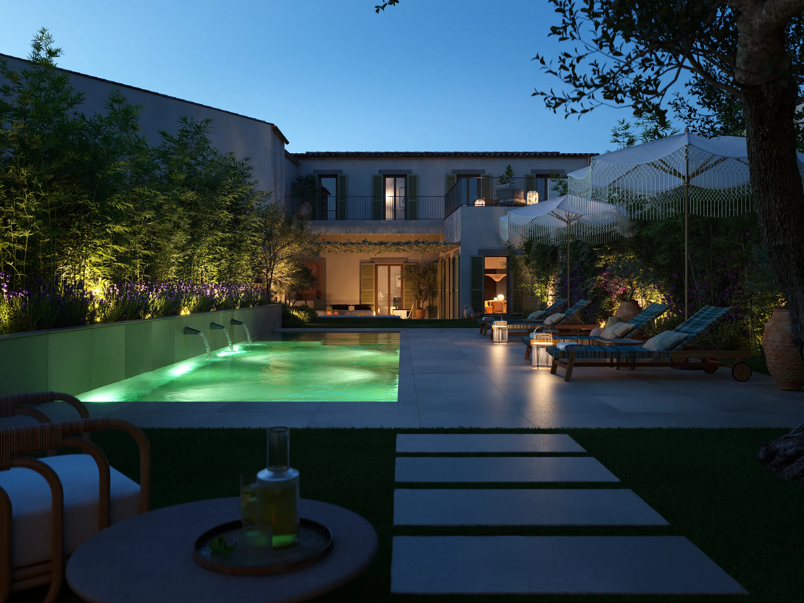
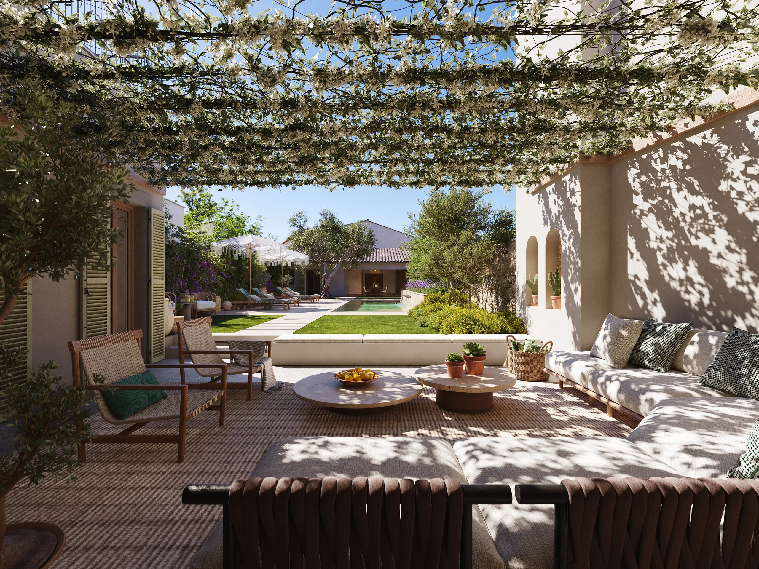
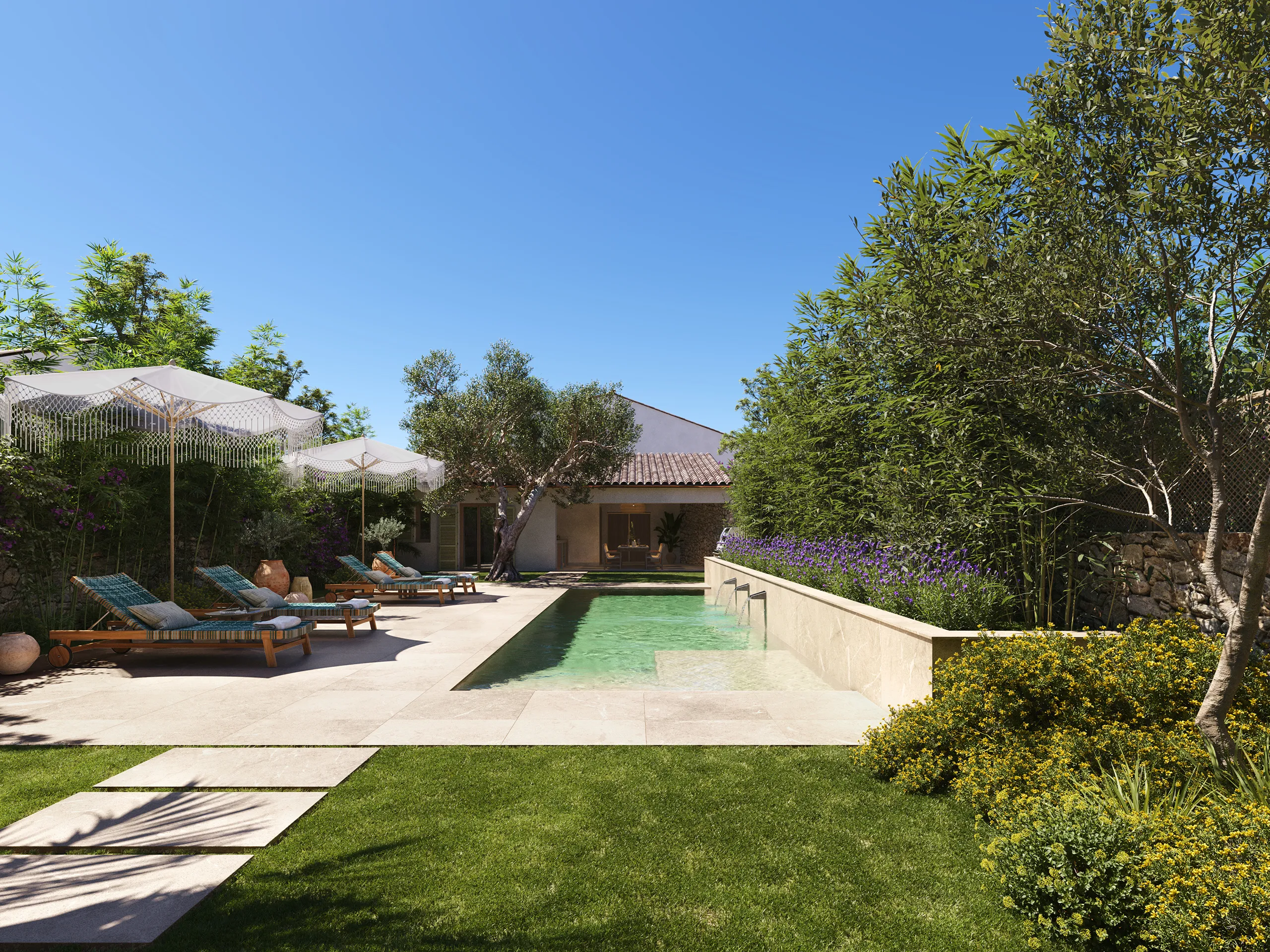
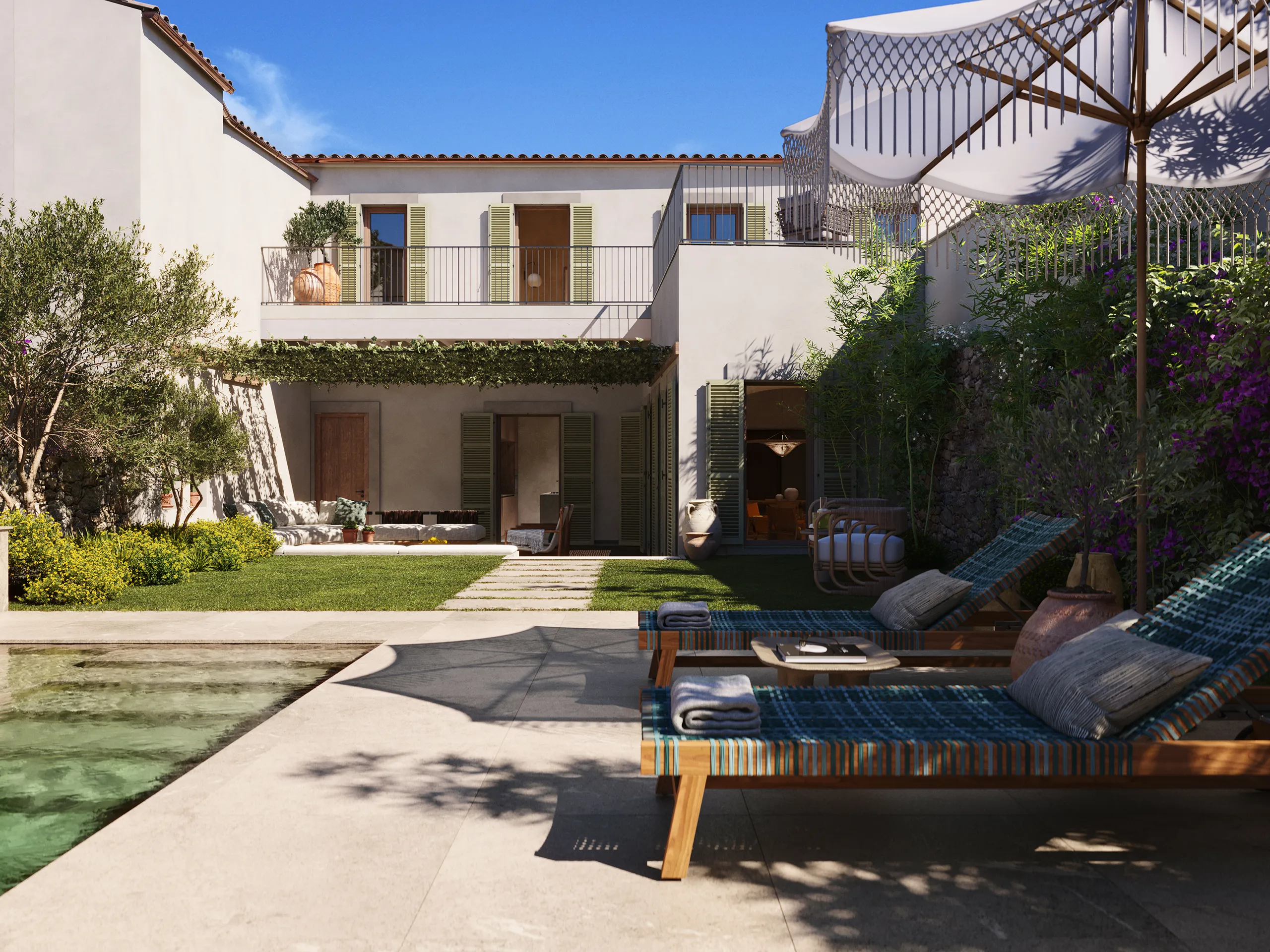
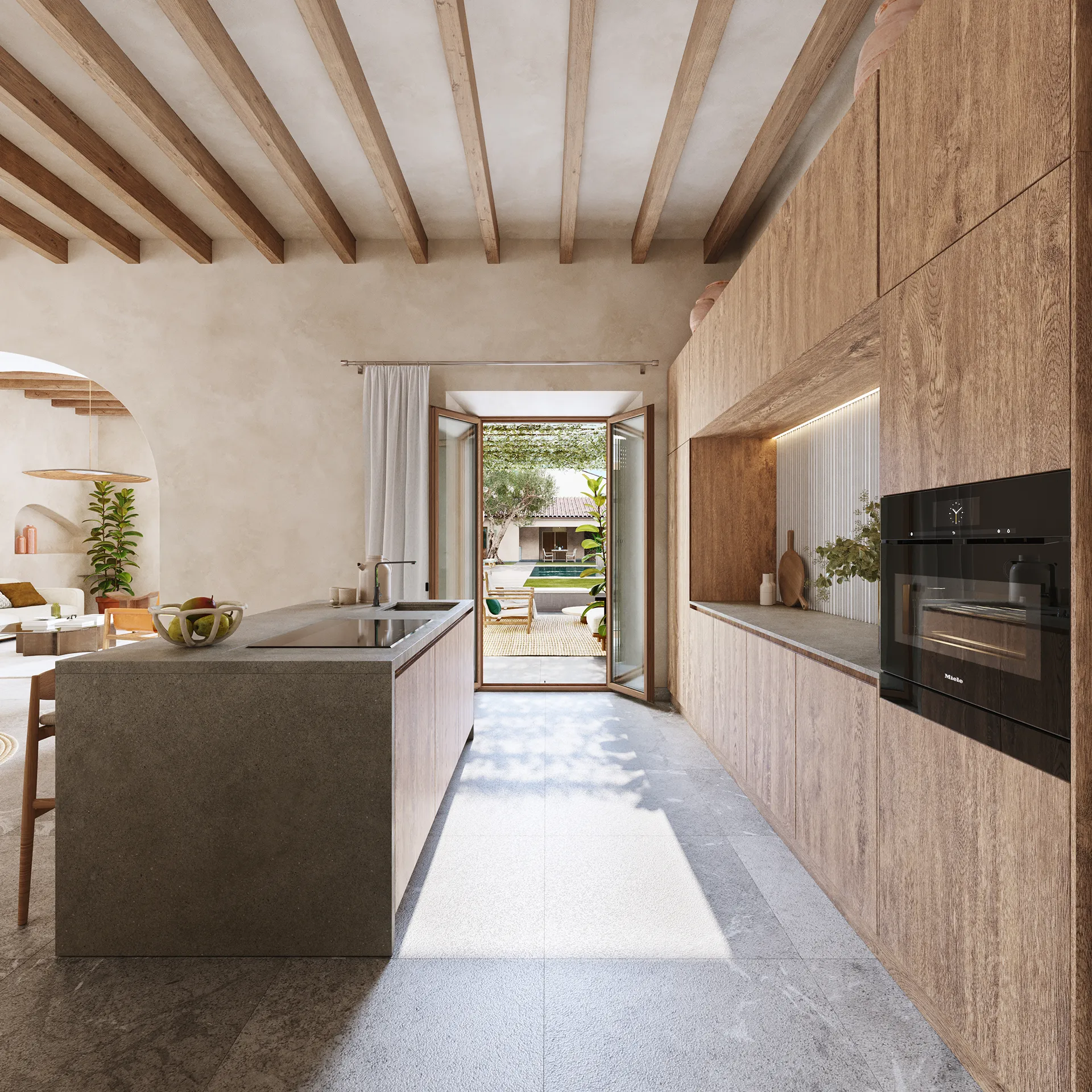
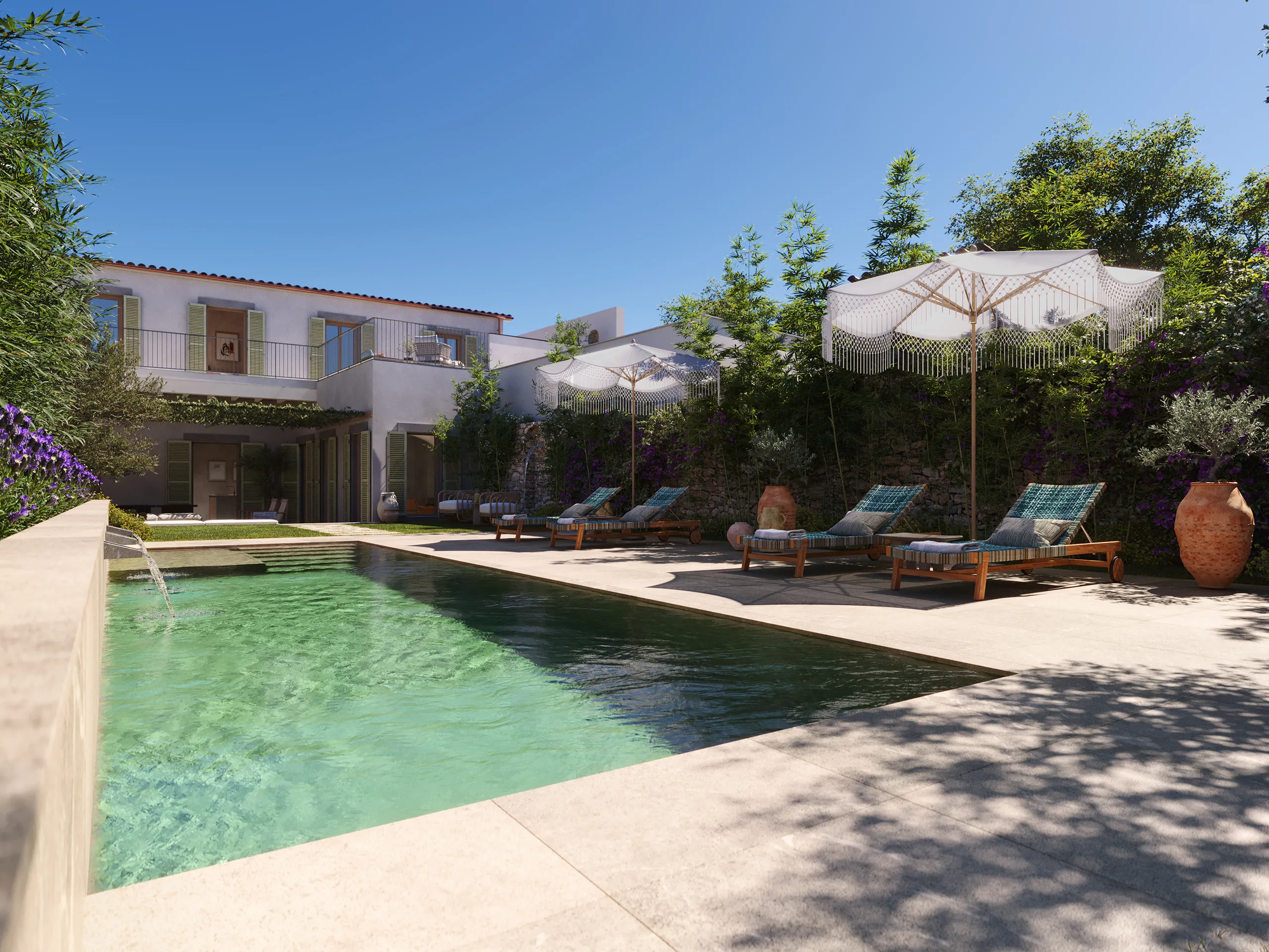
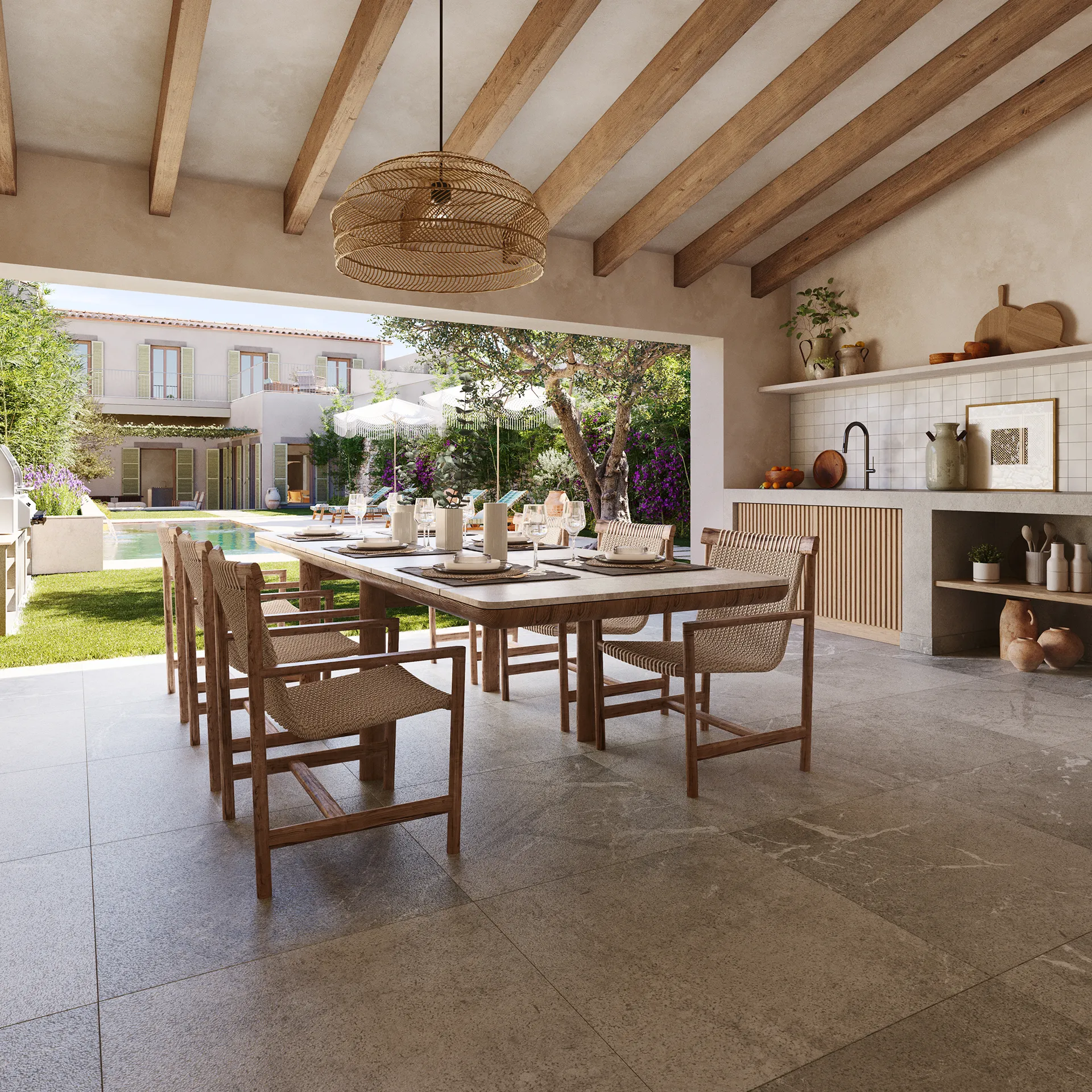
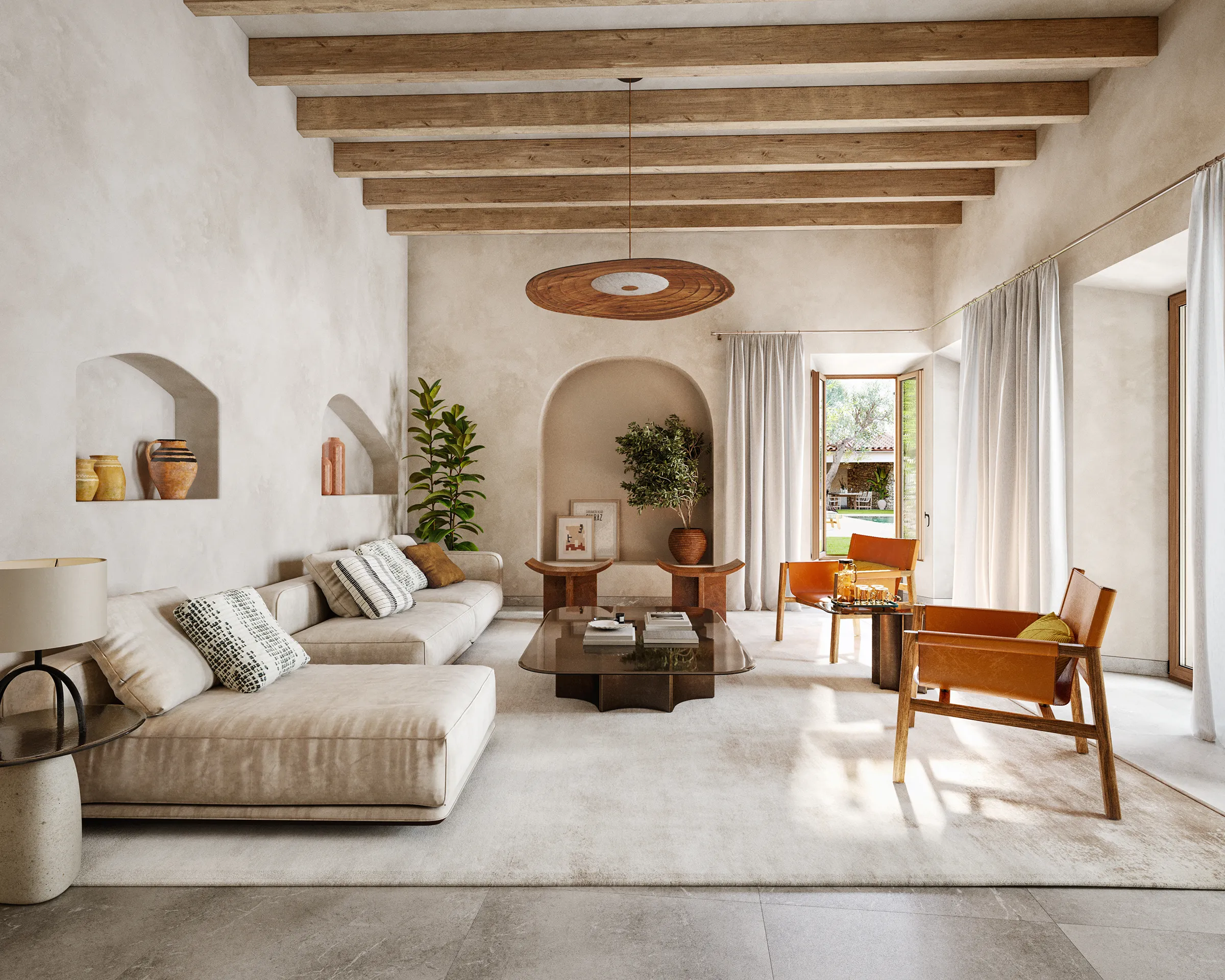
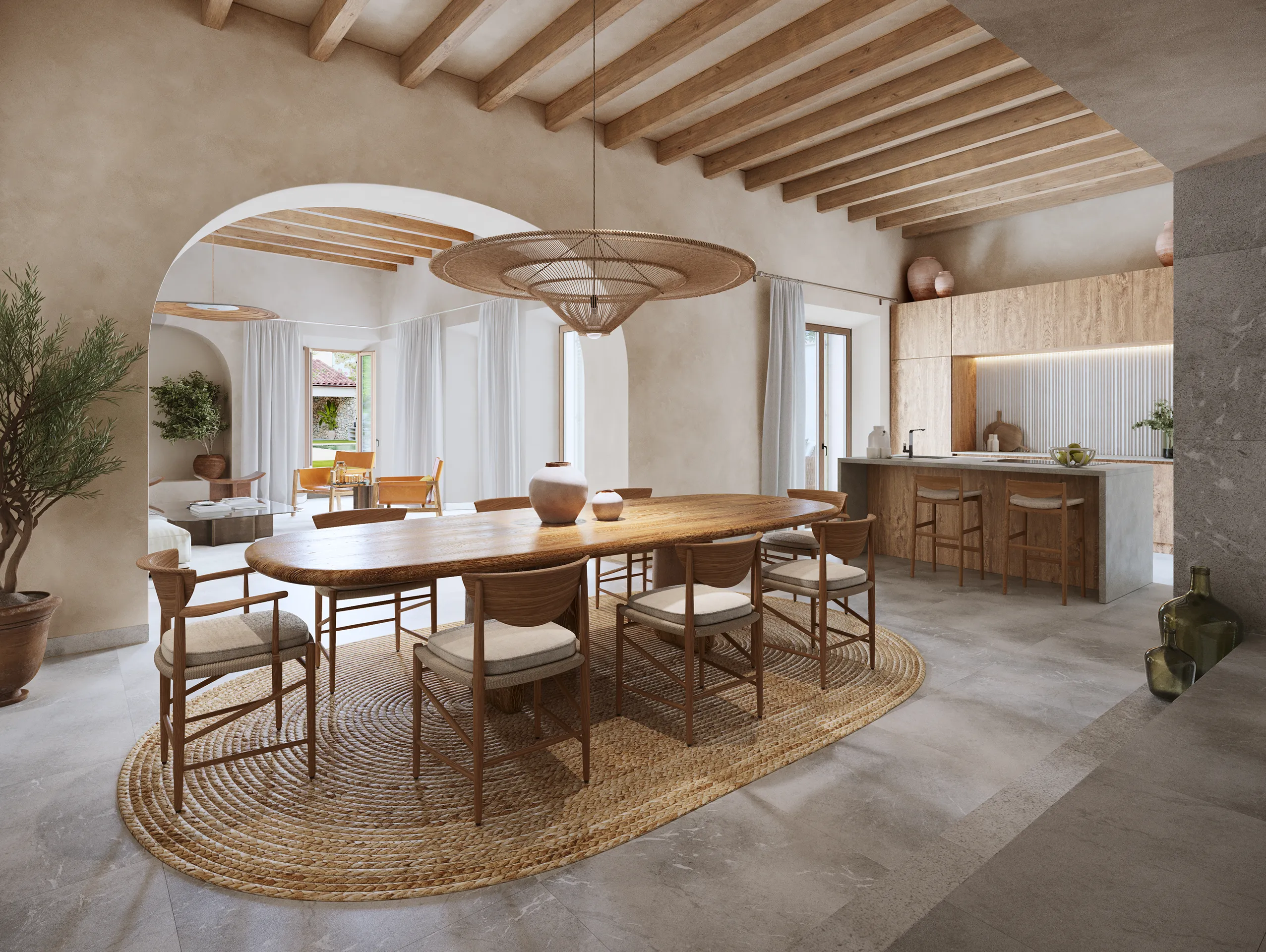
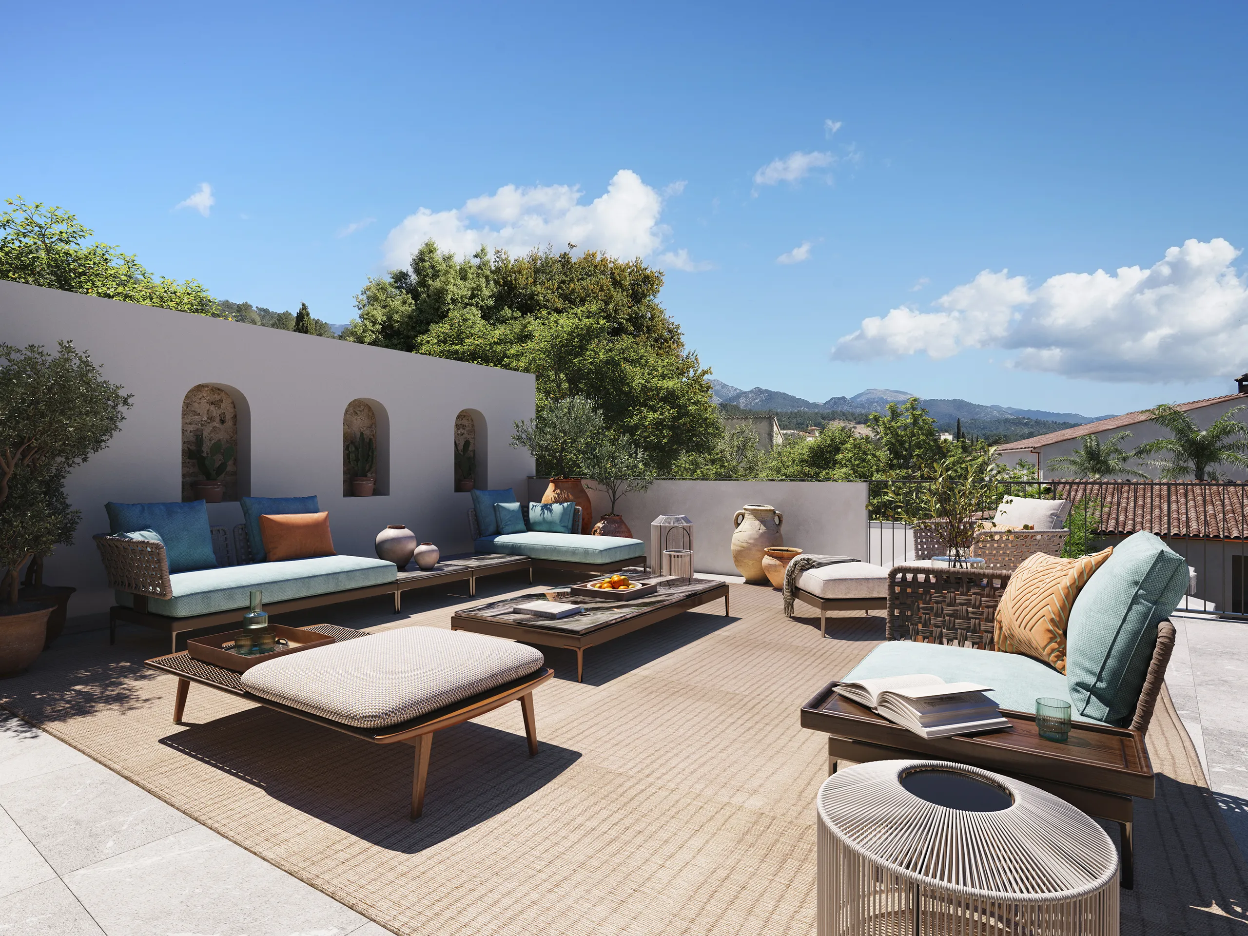
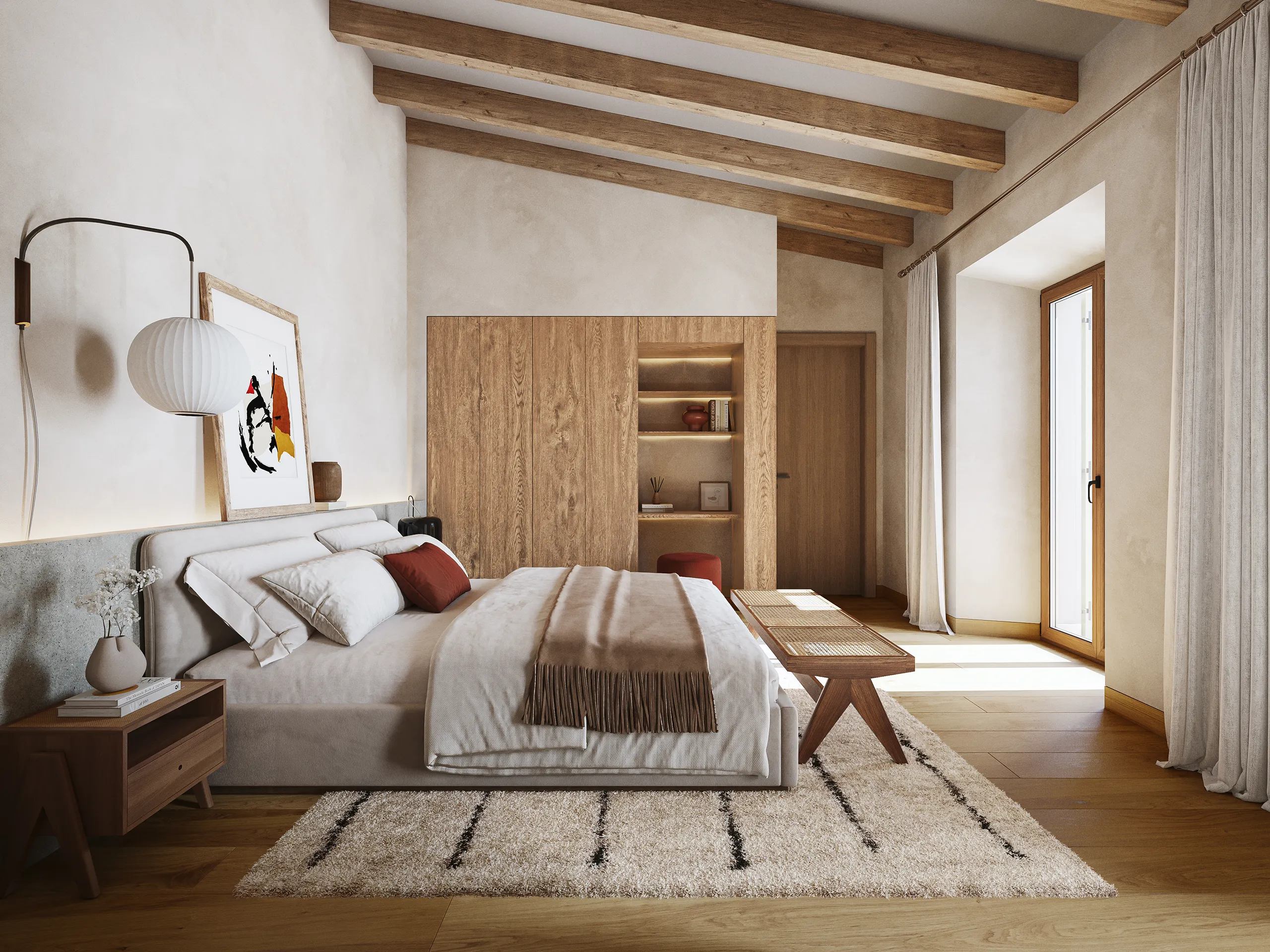
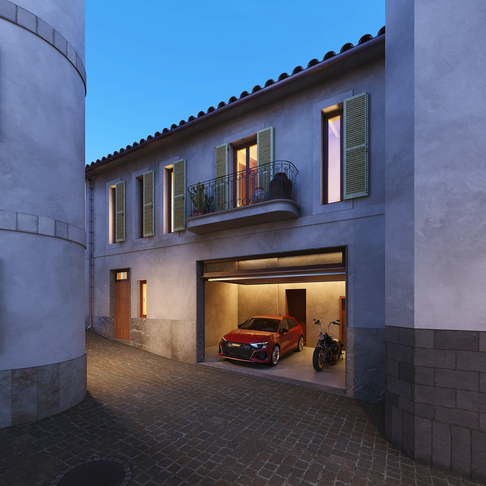
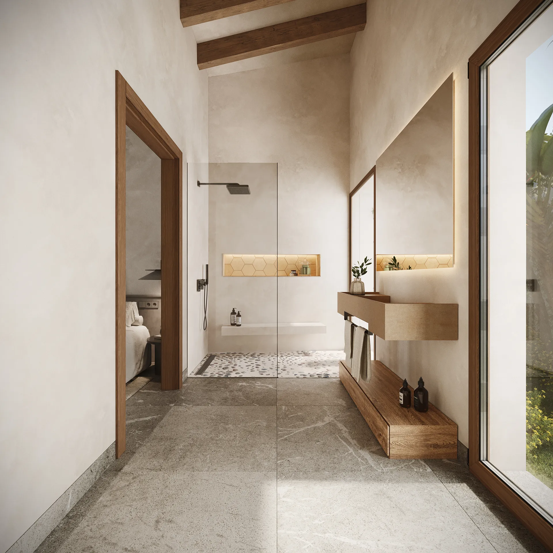
Son Murmuri is a renovated townhouse in Lloseta, Mallorca, and the brief focused on developing the property branding and visual identity for the project. From the outset, the aim was to build the storytelling and translate it into an editorial piece that would support the launch and commercial presentation. This narrative was written as a fable and materialised in a carefully produced book, designed to be read before entering into the technical information.
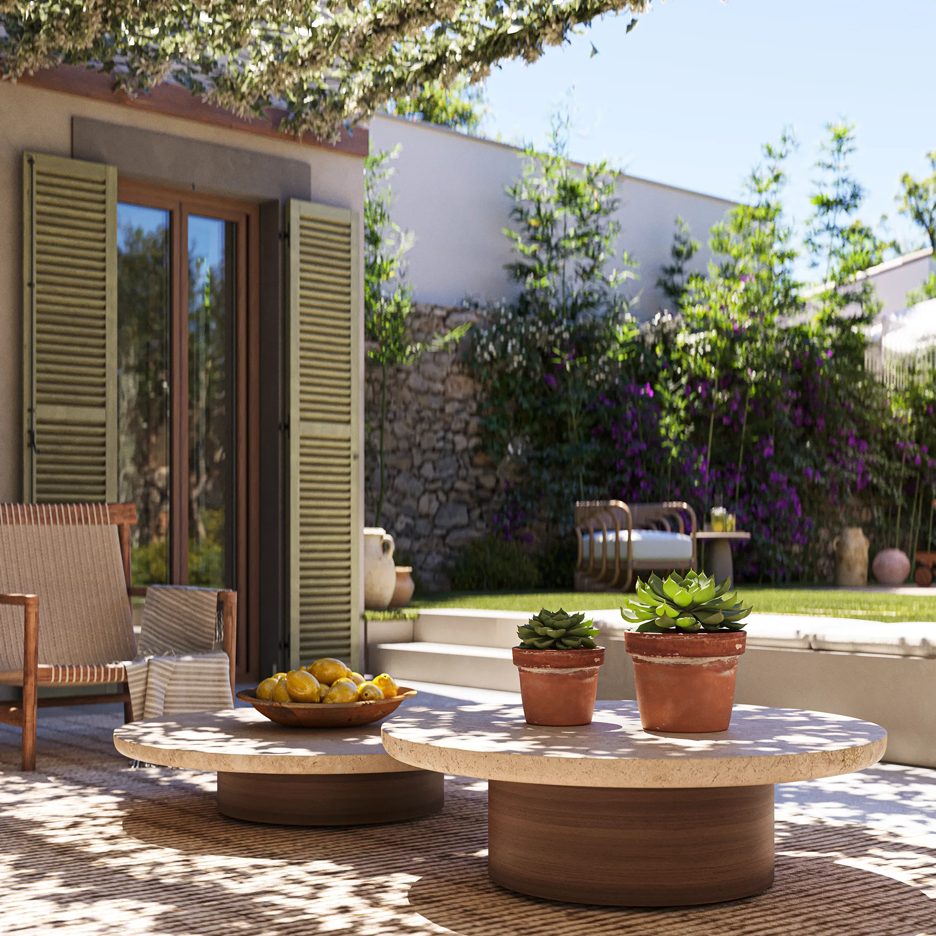
The starting point is simple: the house grows from the garden.
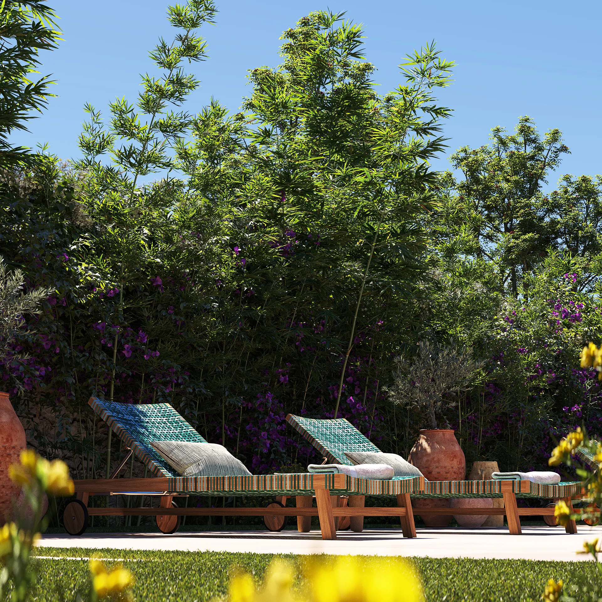
Insects and birds visit that garden and, in a constant murmur, begin asking things of the house. A fountain to drink from in summer, more laughter so the bougainvillea can open, a corner from which water irrigates the garden in silence. Within this logic, every decision is born from a need of the place. The fountain, the shade, the water and the stone walls appear as responses to what the garden, the climate and the house are asking for. Nature stops being a background and becomes a guide: rain, sun, birds or a summer storm help define how the house should be built and inhabited. The house is understood, in this way, as the consequence of having listened.
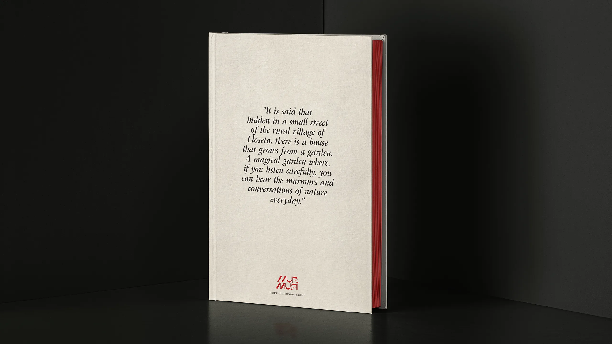
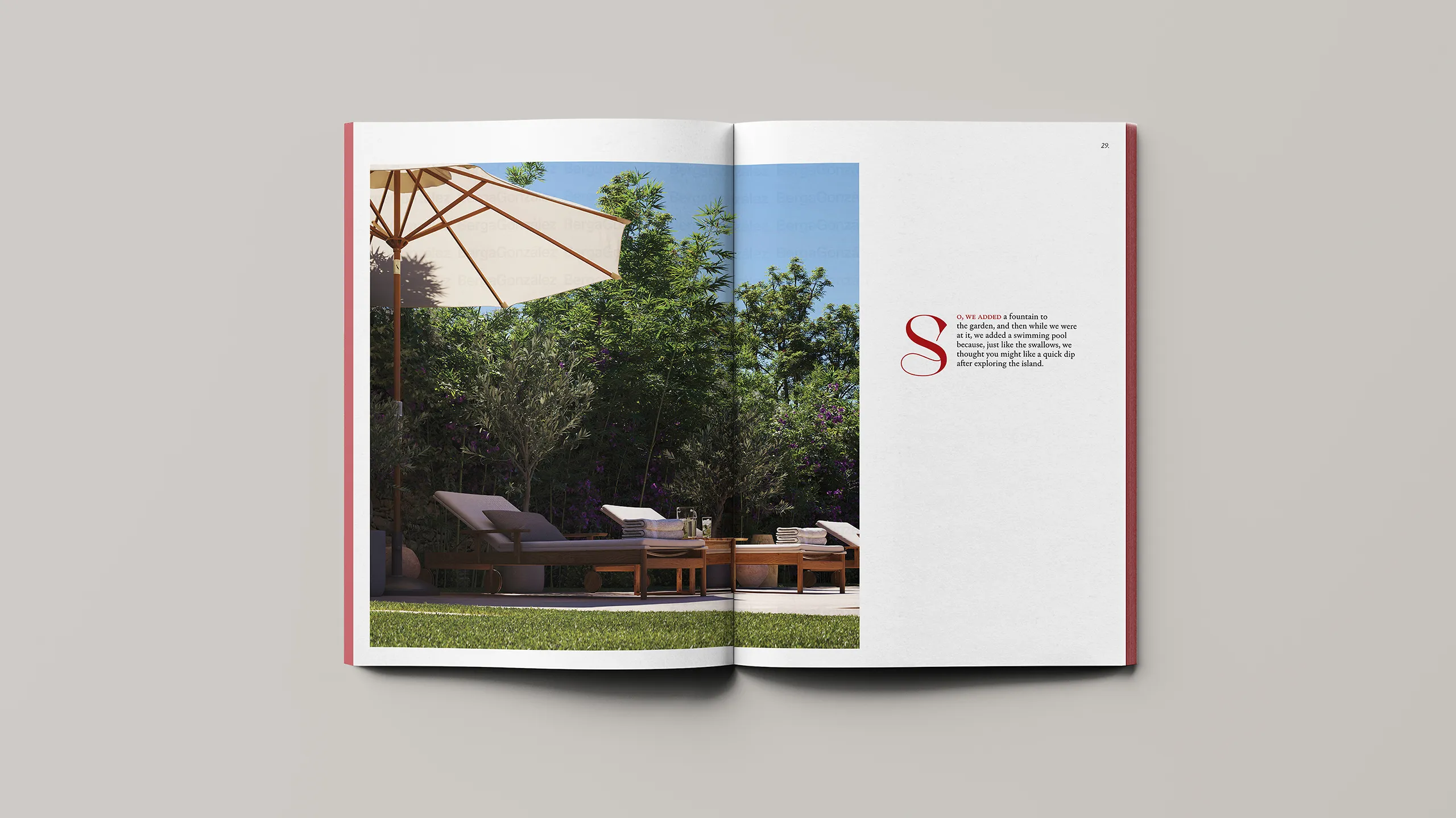
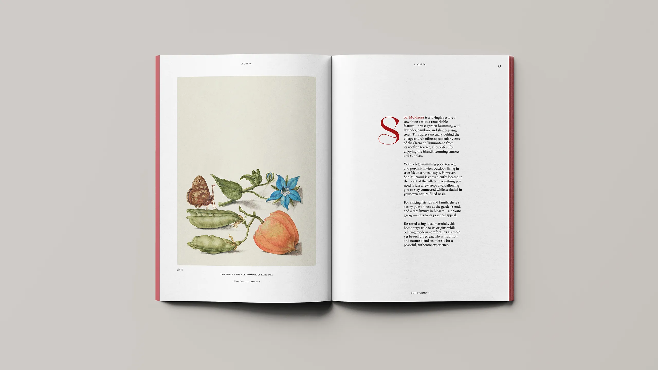
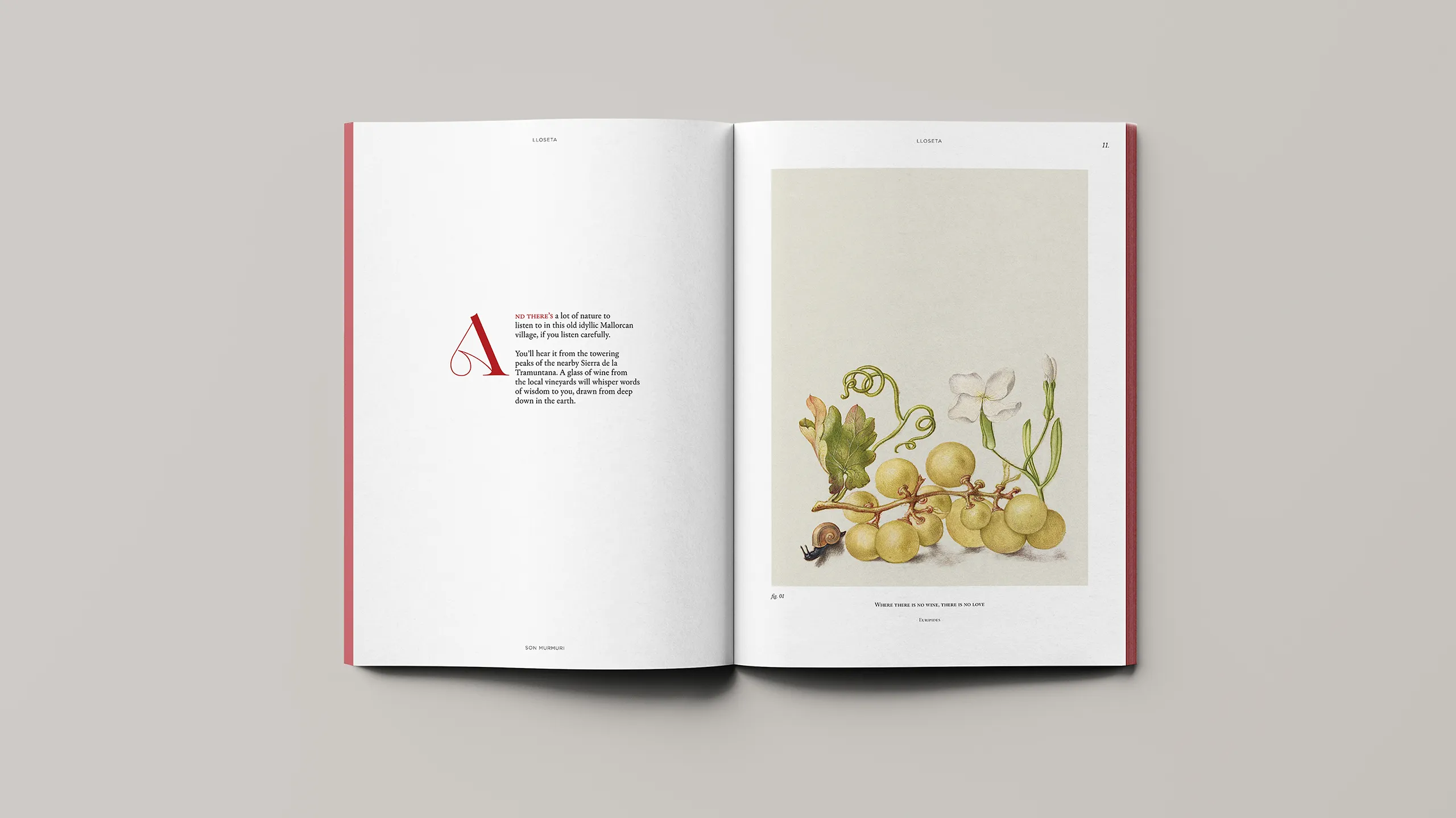
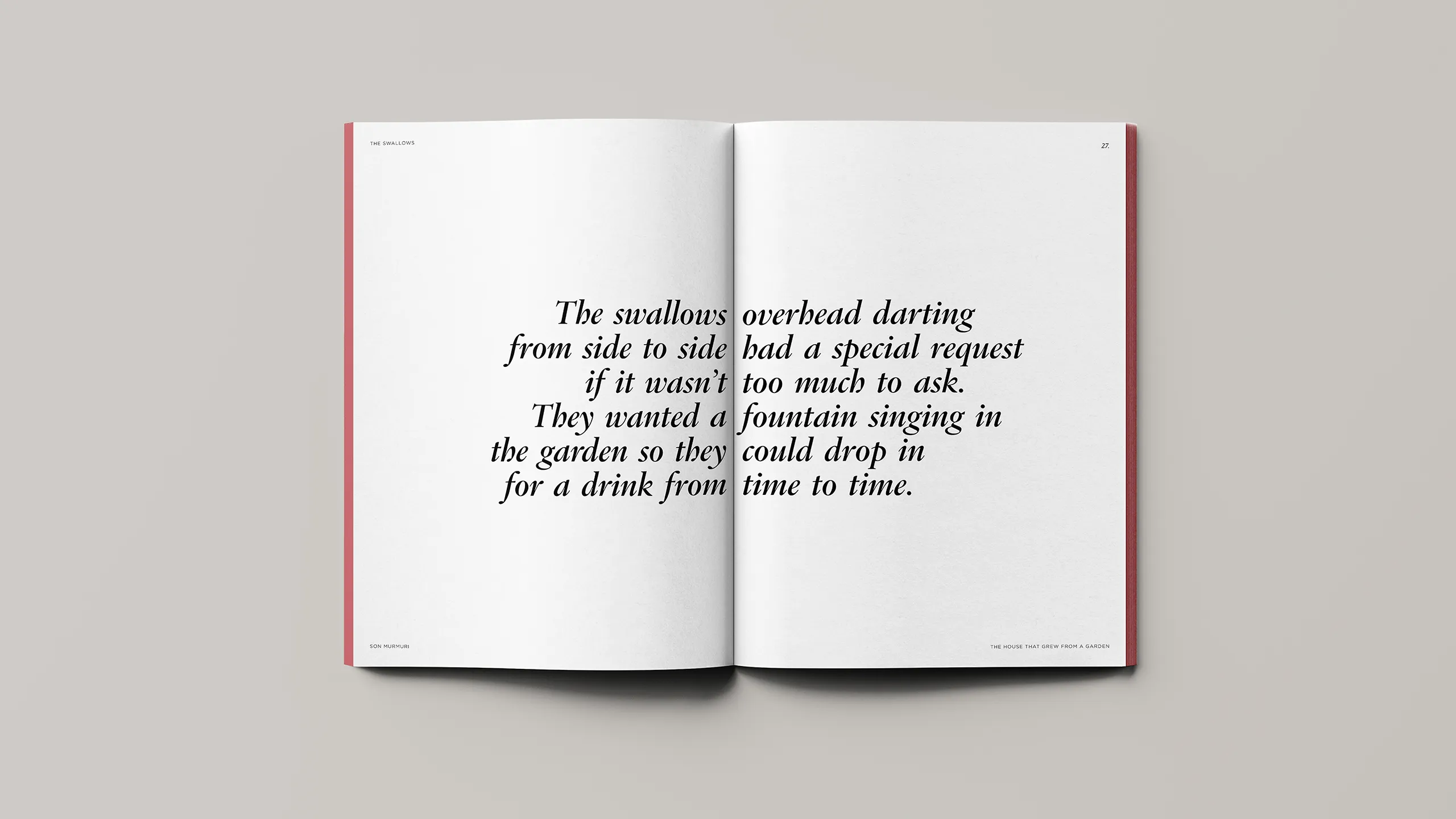

The brand narrative organises the content of the book. First, scenes. Then, voices. Finally, a closing passage that leaves the reader in silence: the air moves the curtains and the sound that crosses the house becomes, once again, the sound of the outside — a soft murmur confirming that the garden is still there. Only then does the technical section begin. The book works as a gradual entrance into the property: it turns the programme into an experience and prepares the context so that the data, plans and specifications are read with a different kind of attention.
The visual identity supports this idea through an editorial graphic language. The logotype is built as a conversation, with a distinctive detail in the “R” that acts as a sign and point of recognition. The visual universe draws on botanical references and a notebook-like sensibility, closer to observation and collection than to ornament. In this way, the brand keeps the story alive without making it literal, allowing Son Murmuri to be presented with its own voice throughout the book.
Log in