Let's talk
We can't wait to hear allabout your plans.
We can't wait to hear all
about your plans.
Come visit us if you are
in town,
drop us a line to
or call us anytime
More info
Year
2022
Location
Formentera, Formentera
Typology
Singular housing
Developer
Ax Partners
Services
Property Branding, Architectural Visualization, Design Consulting, CG Images, CG Film, Interior Design, Landscape Design, Digital, Brand Identity, Brand Strategy, Editorial
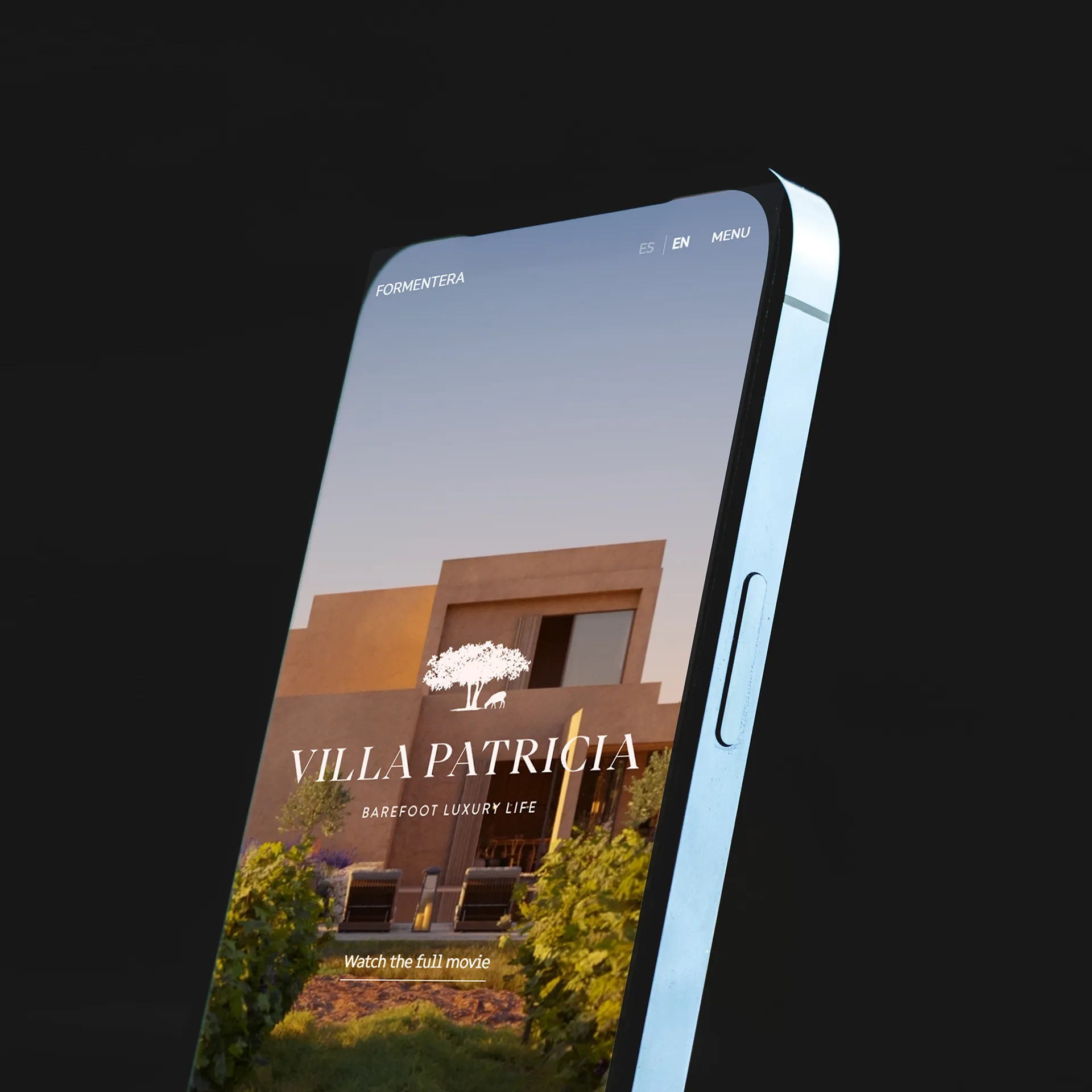
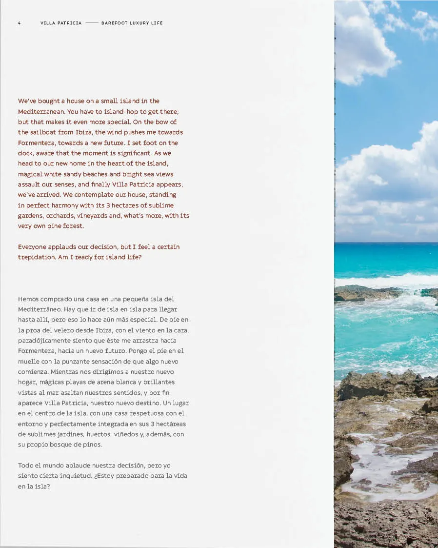
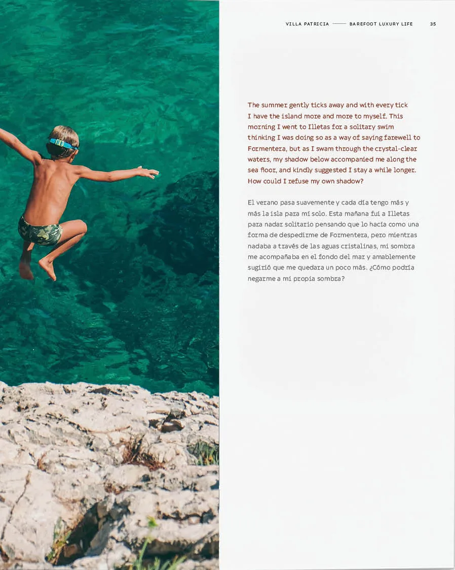
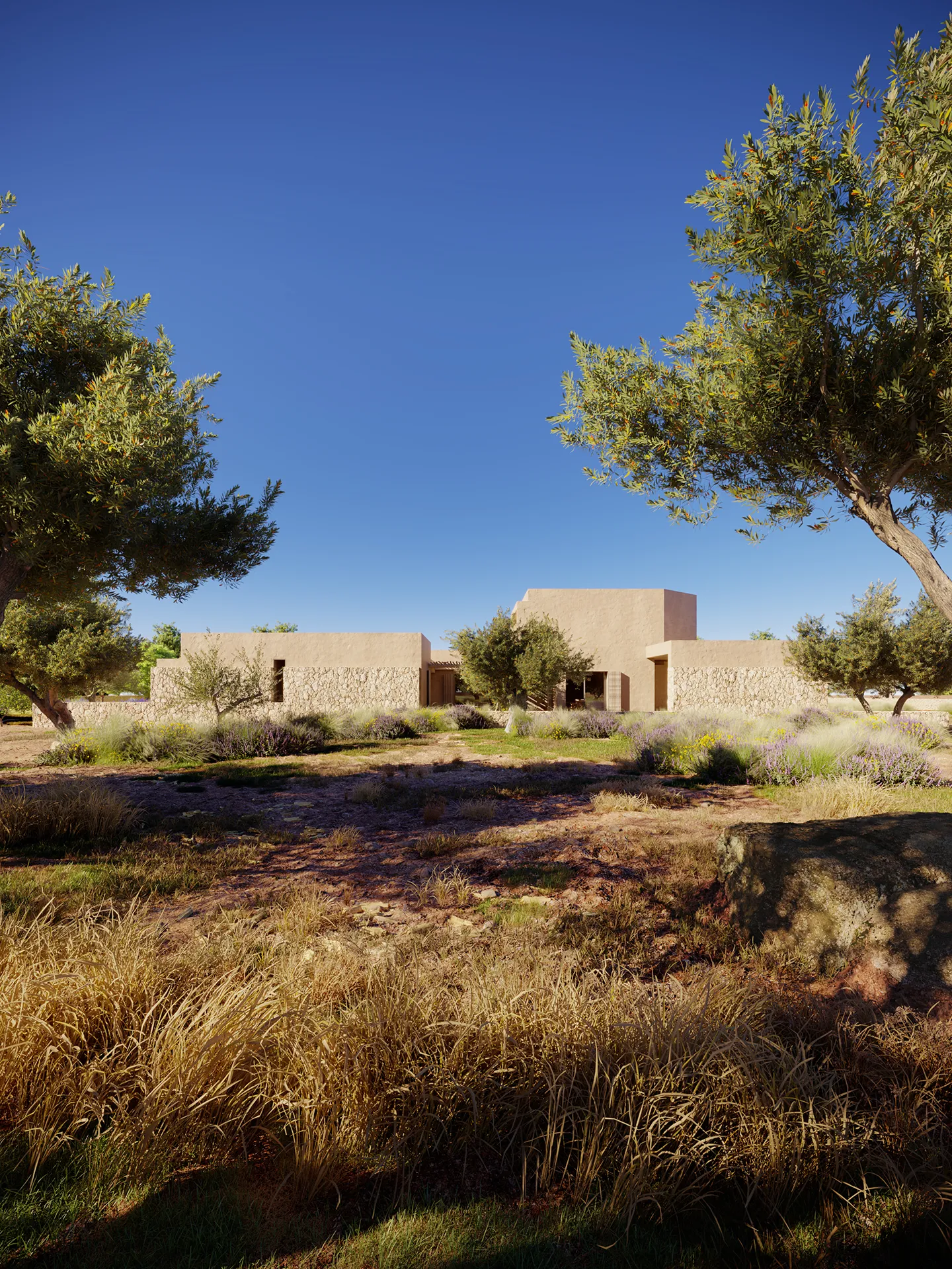
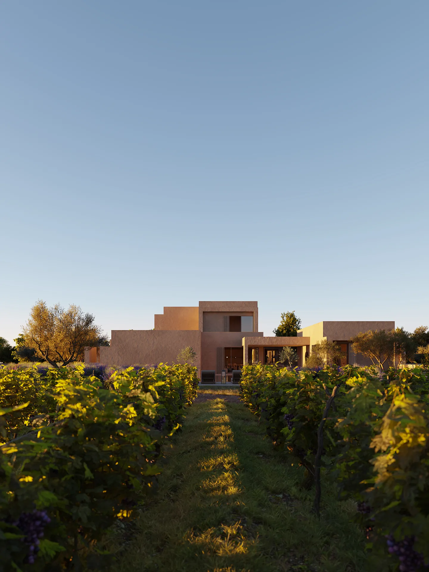
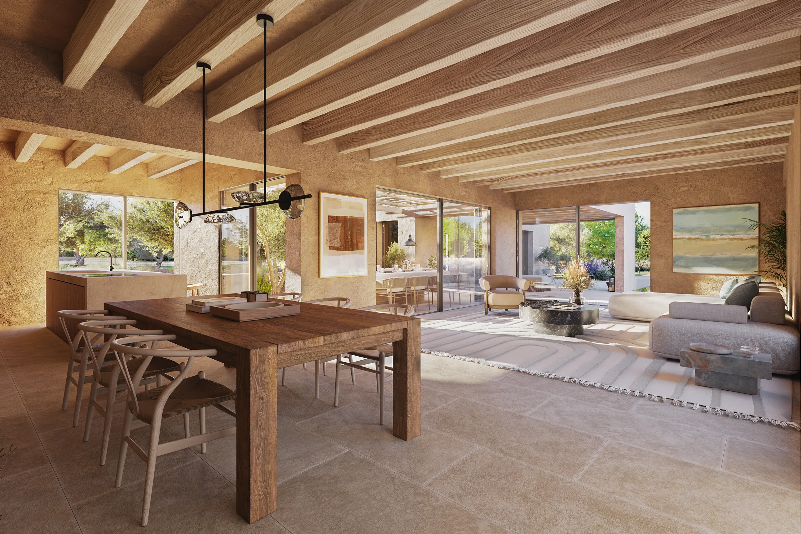
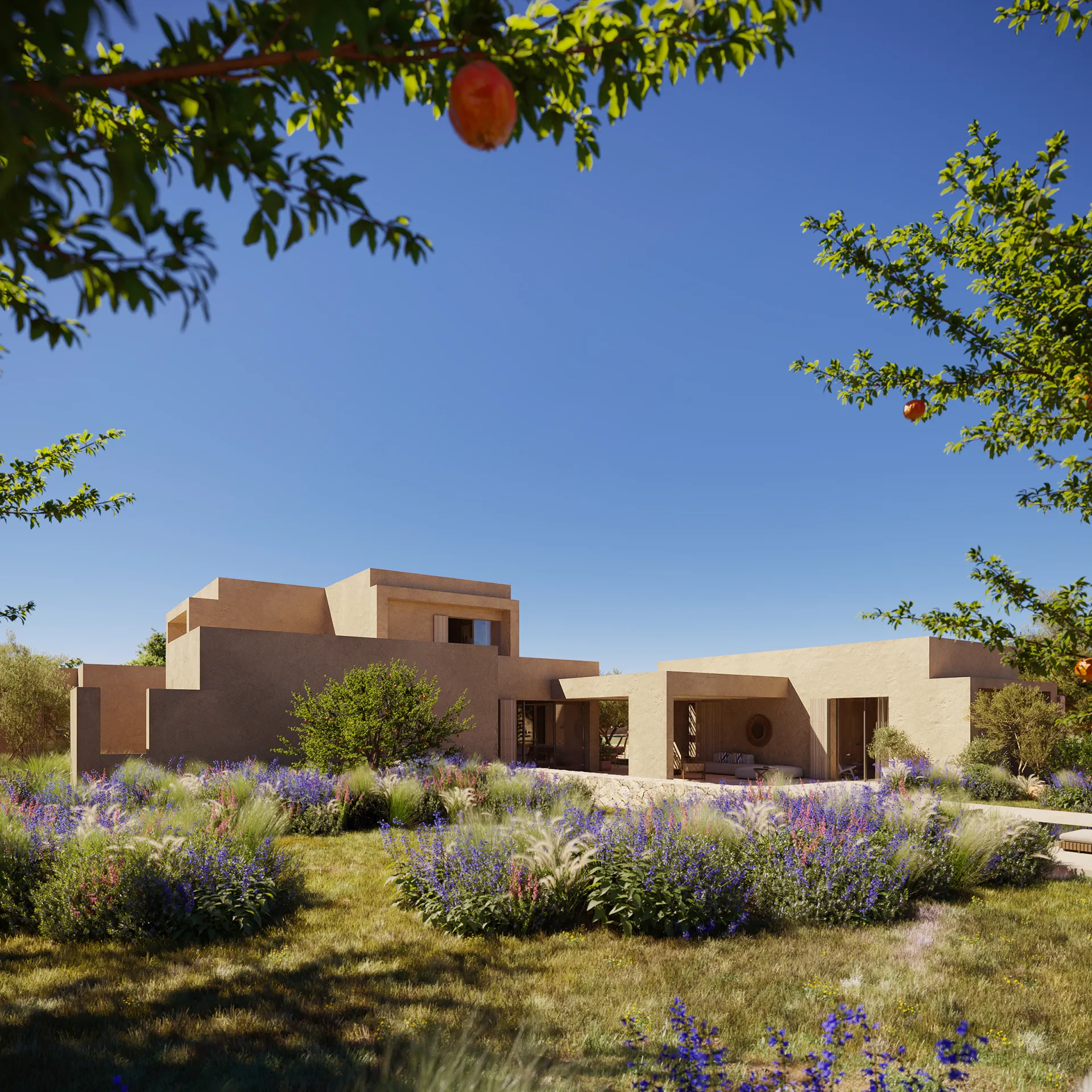
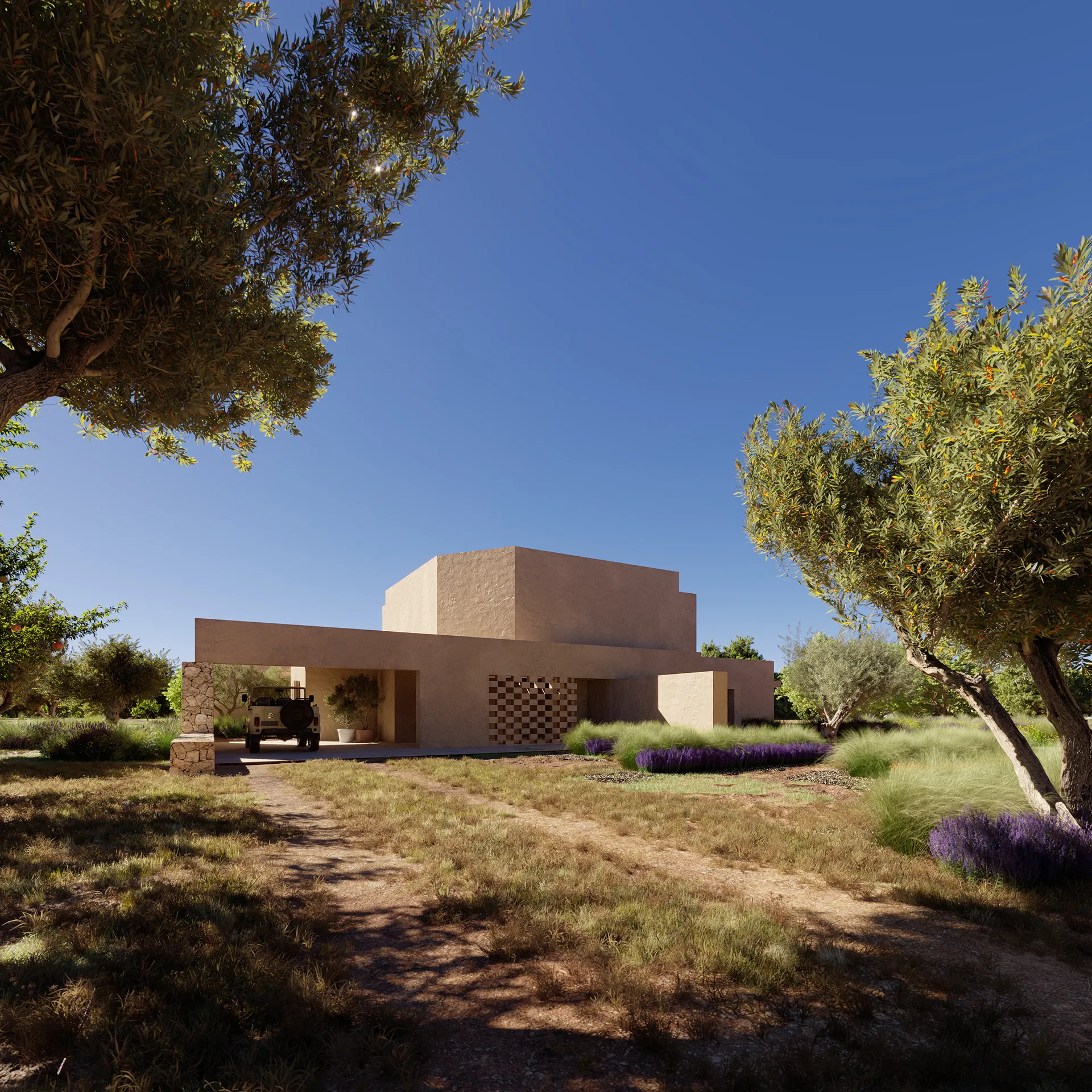
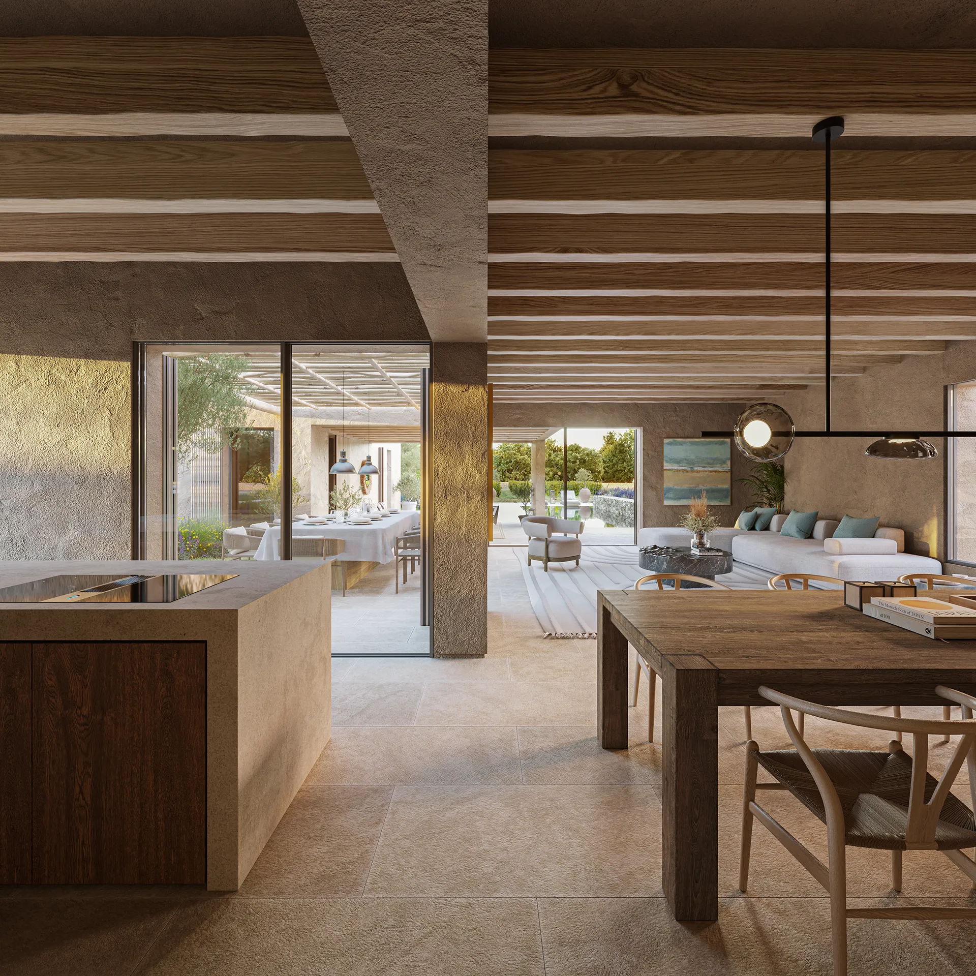
Villa Patricia is a distinguished residence in Formentera. The brief focused on property branding, with the narrative unfolding through a printed brochure enriched by evocative renders of the home and imagery of the island. The text adopts the perspective of a visitor arriving from the city, capturing their transition as they surrender to Formentera’s rhythmic pace and gradually become an islander.
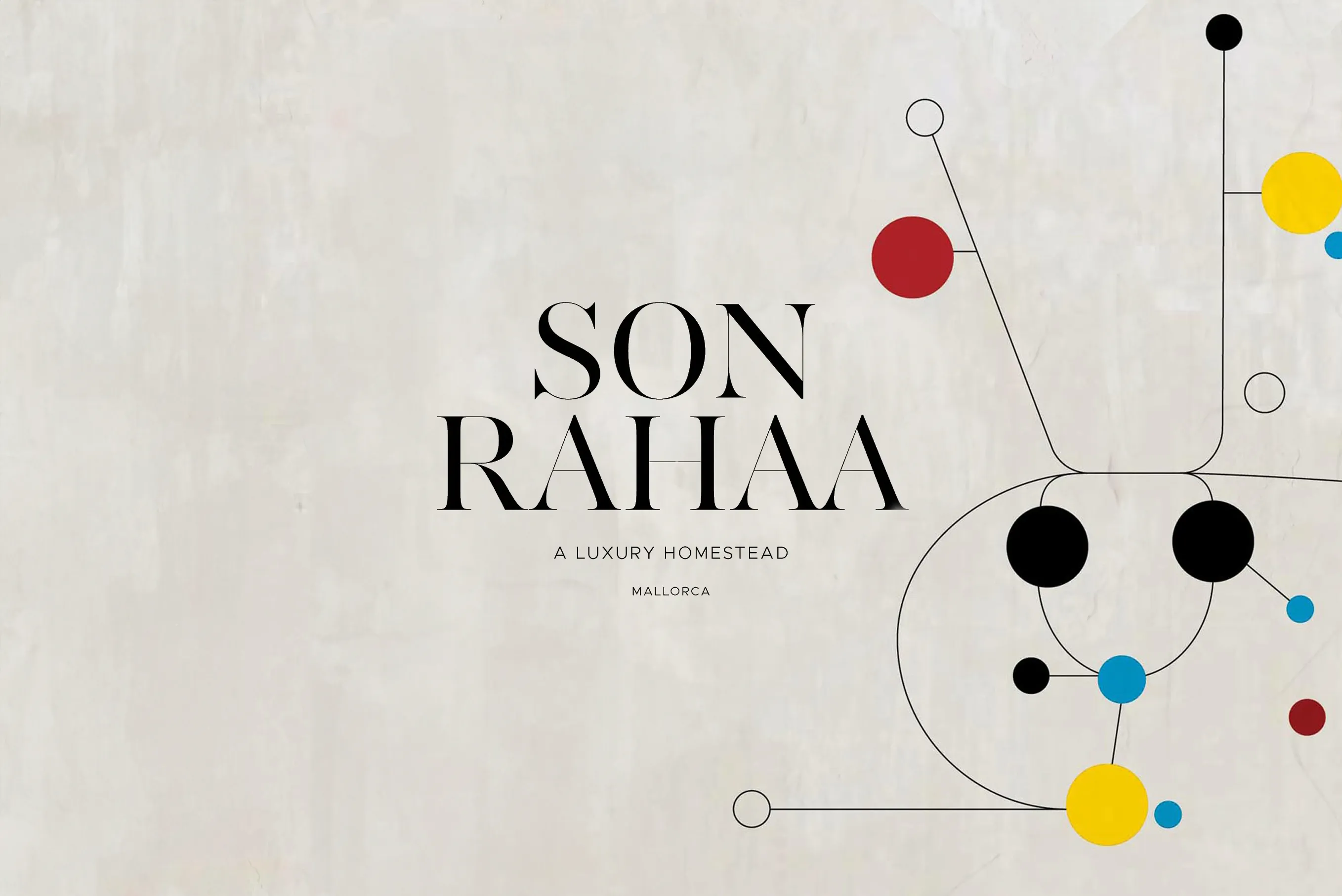
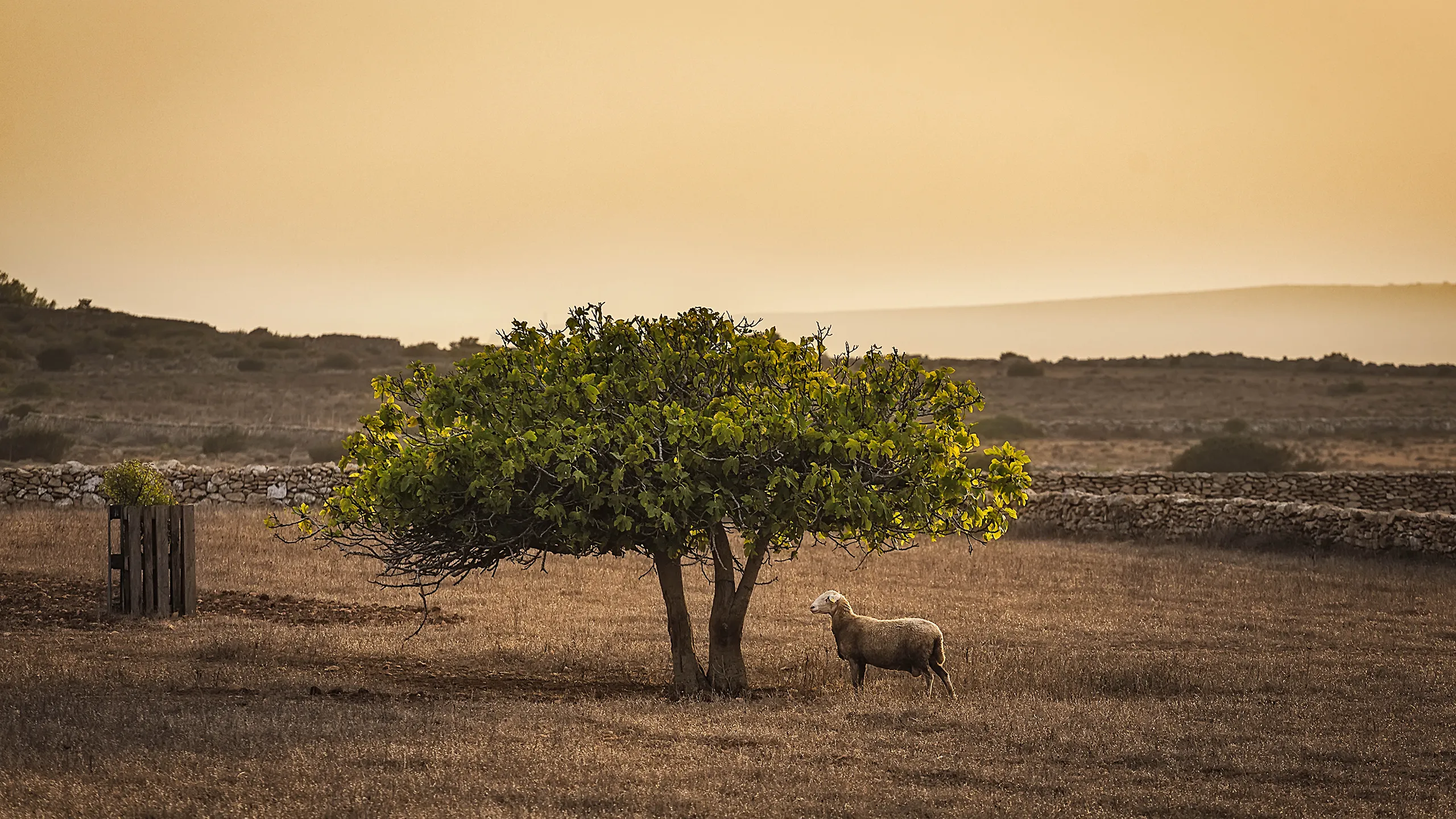
The logo merges two instantly recognisable elements of the local landscape: the silhouette of a sheep beneath a fig tree. This imagery anchors the house to the island from the very first encounter on the book’s cover. The name is set in a high-contrast serif typeface, giving it clarity and balance between grace and visual strength.

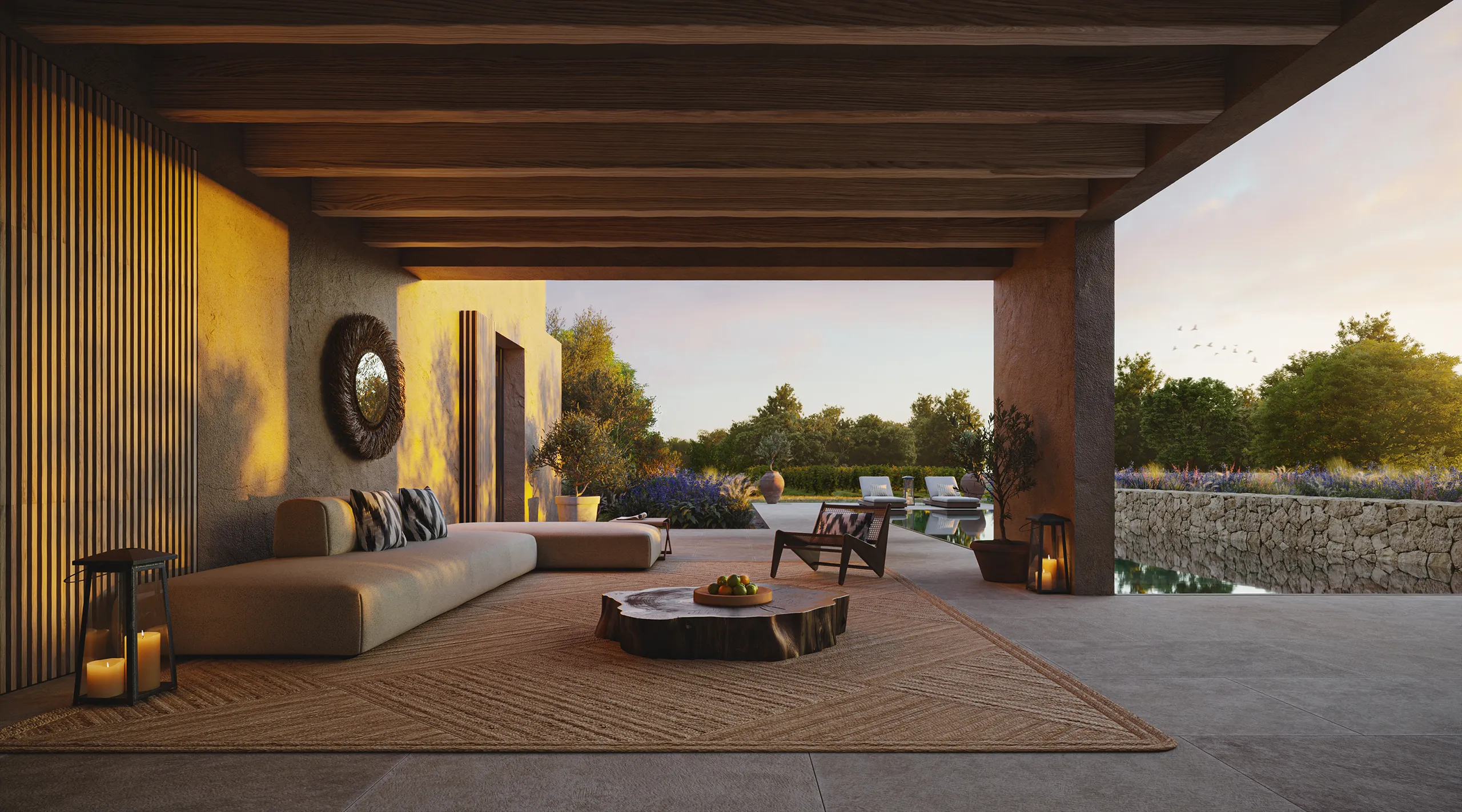
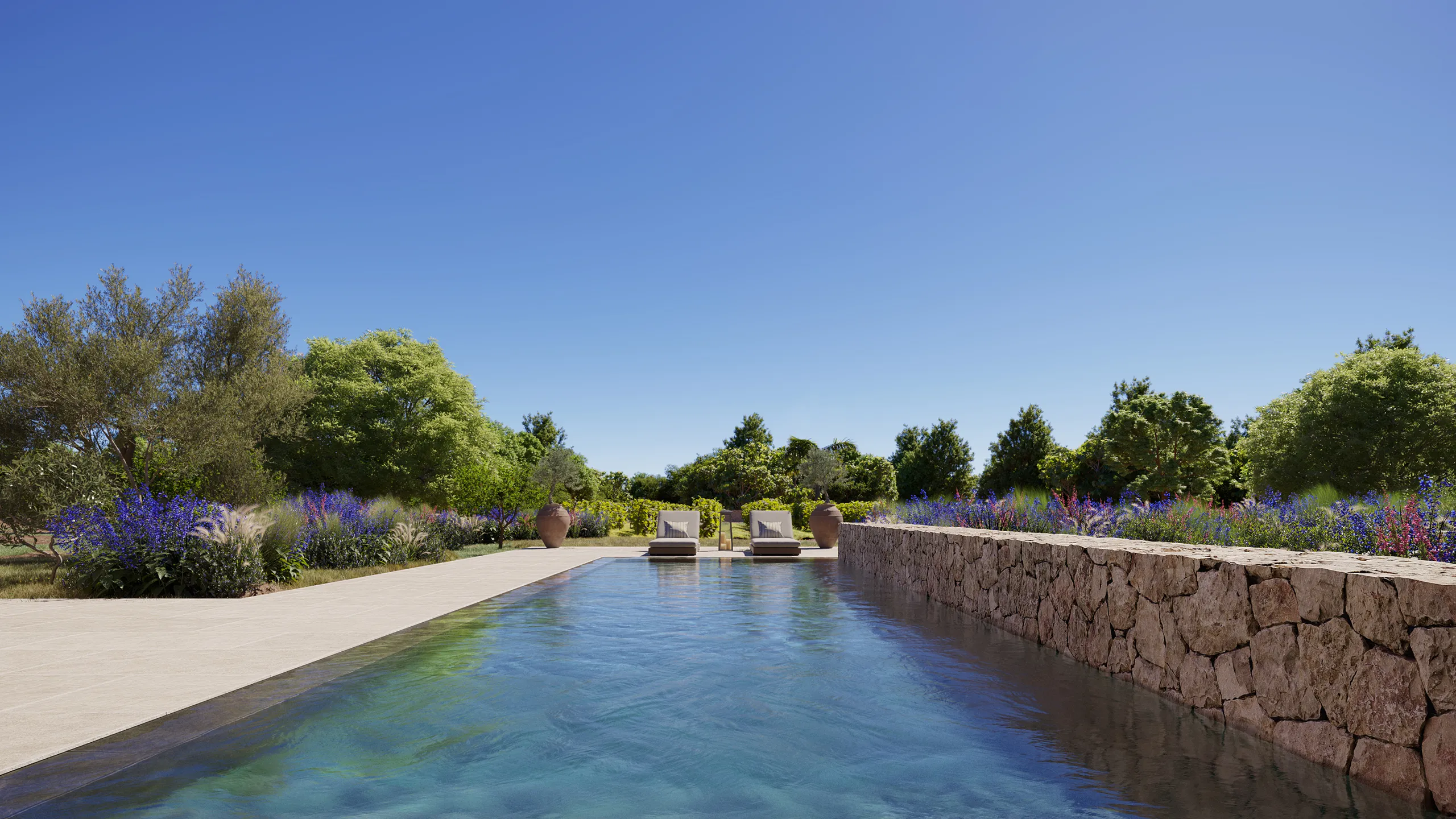
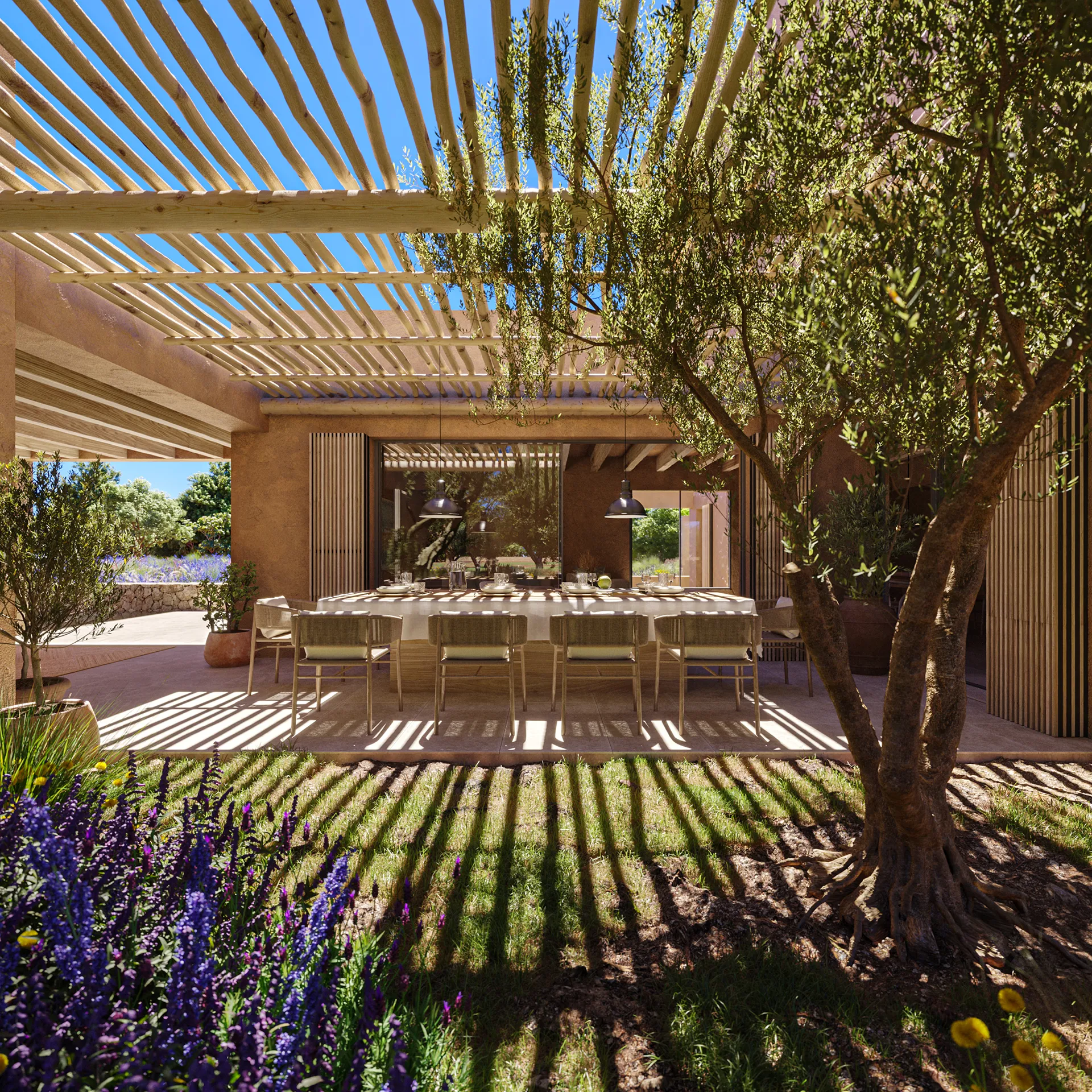
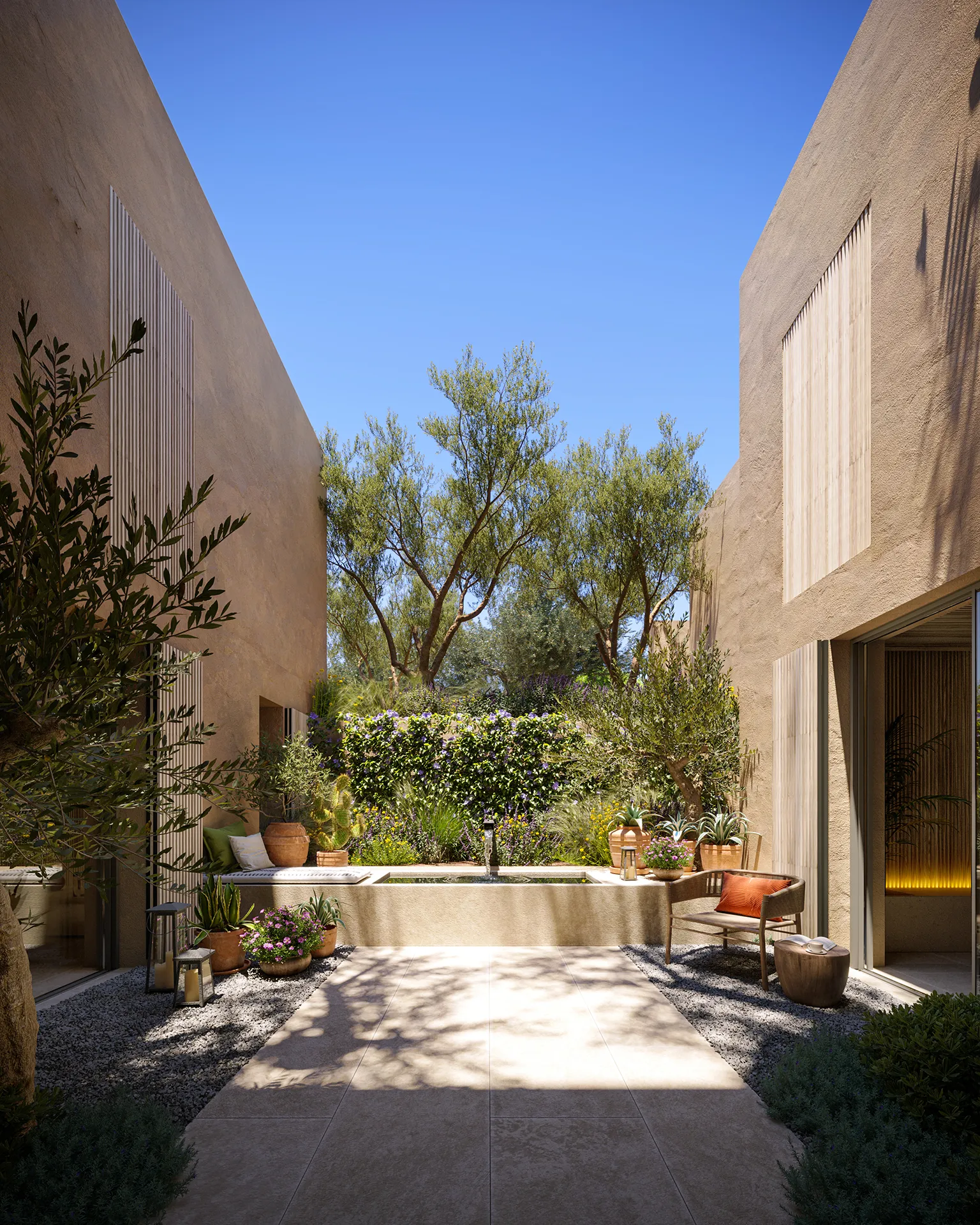
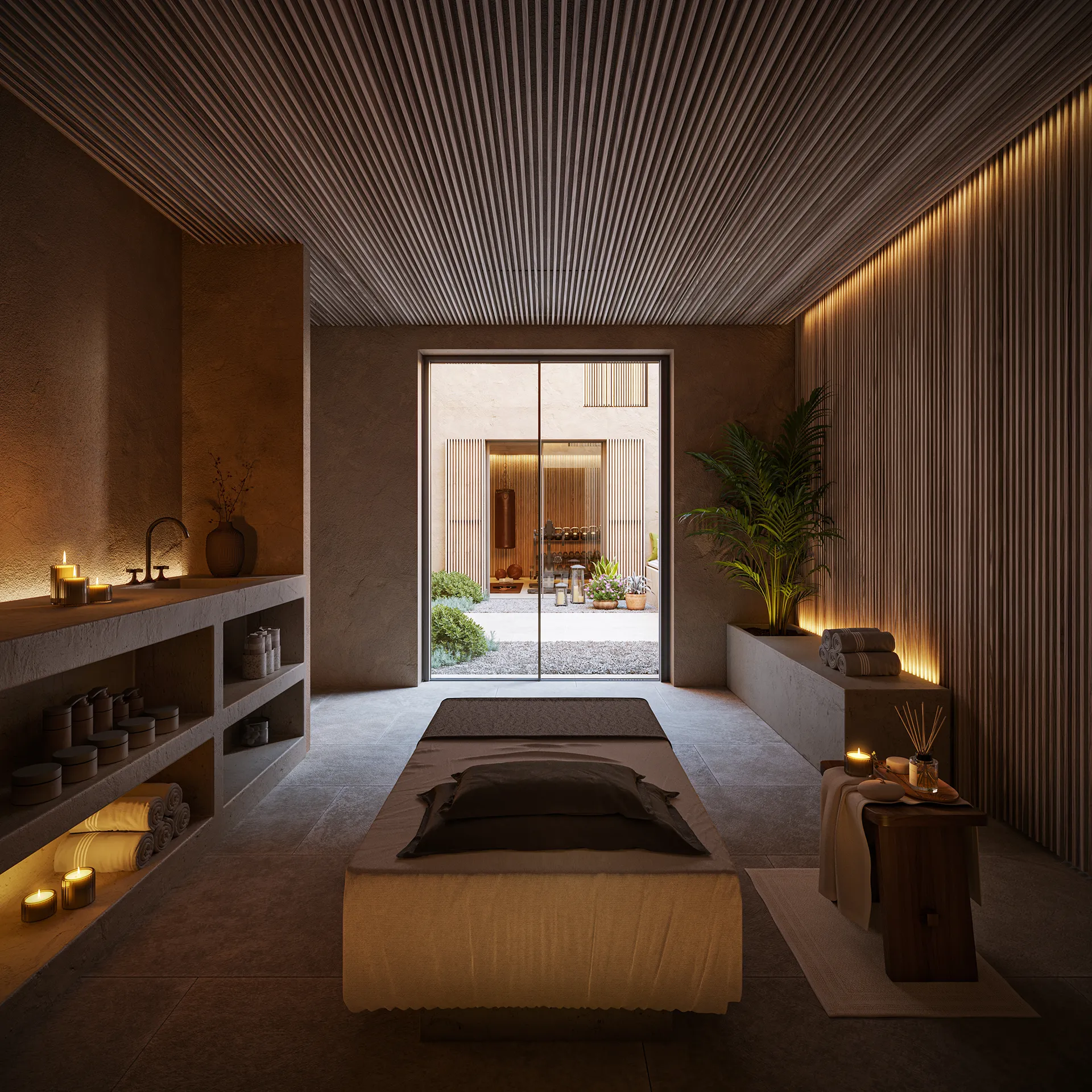
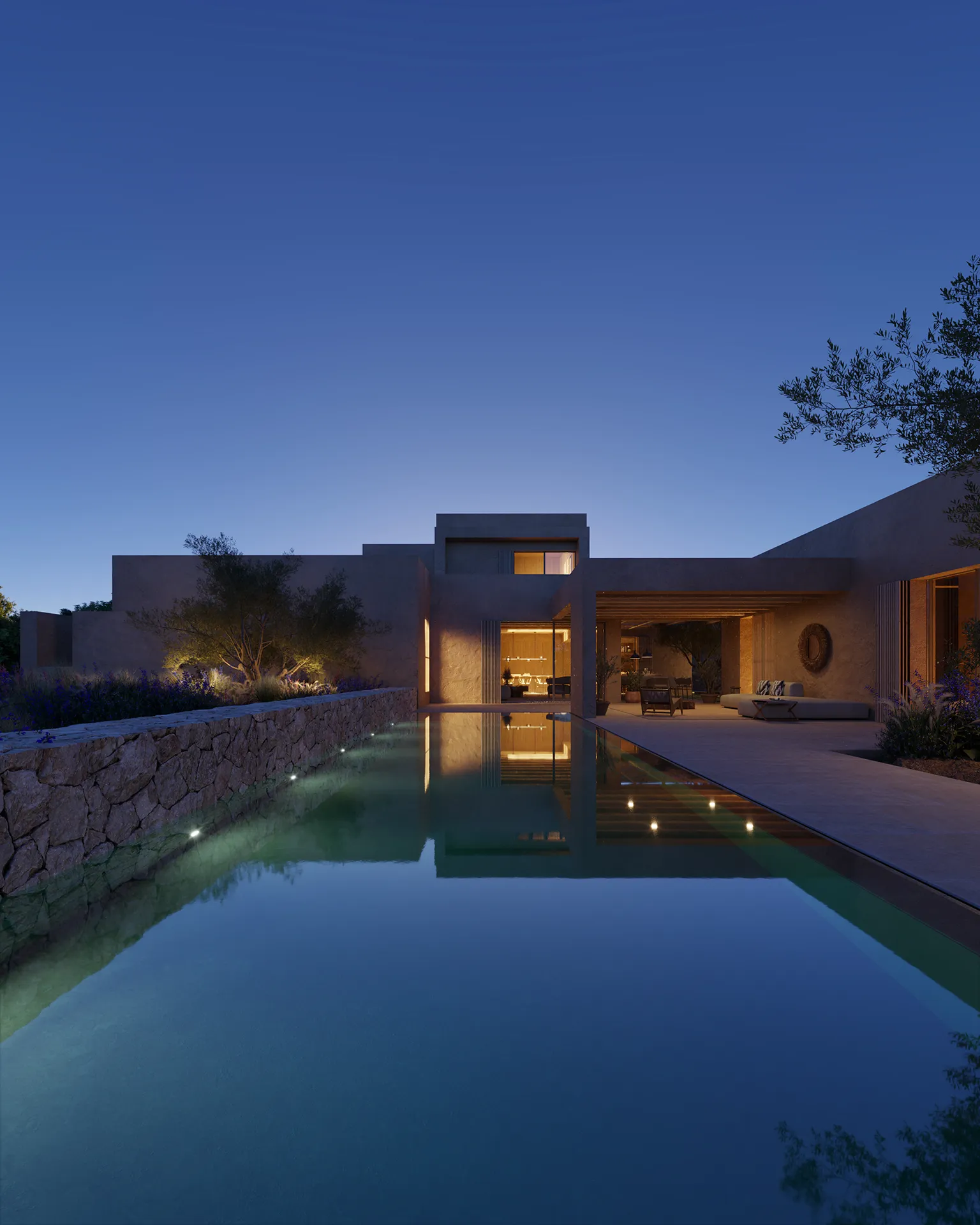
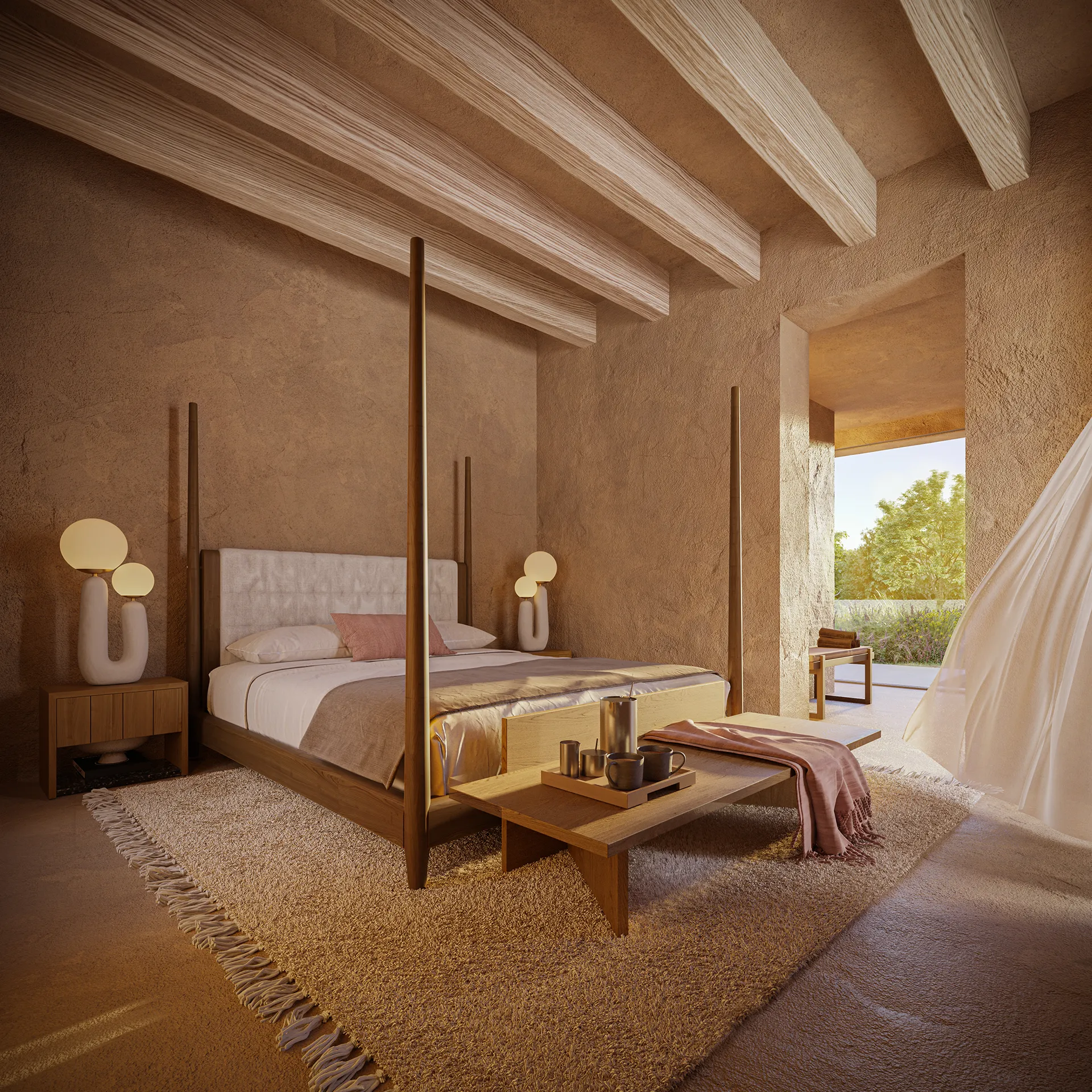
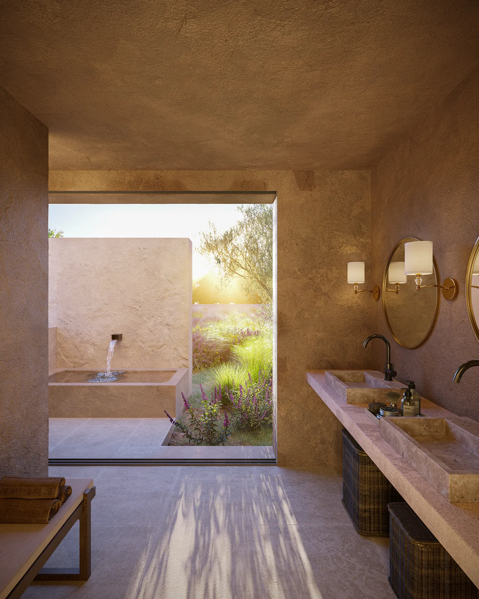
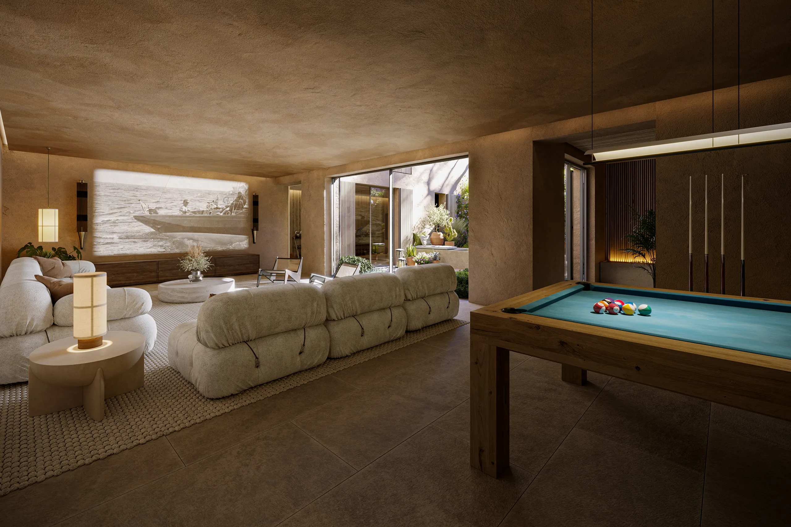
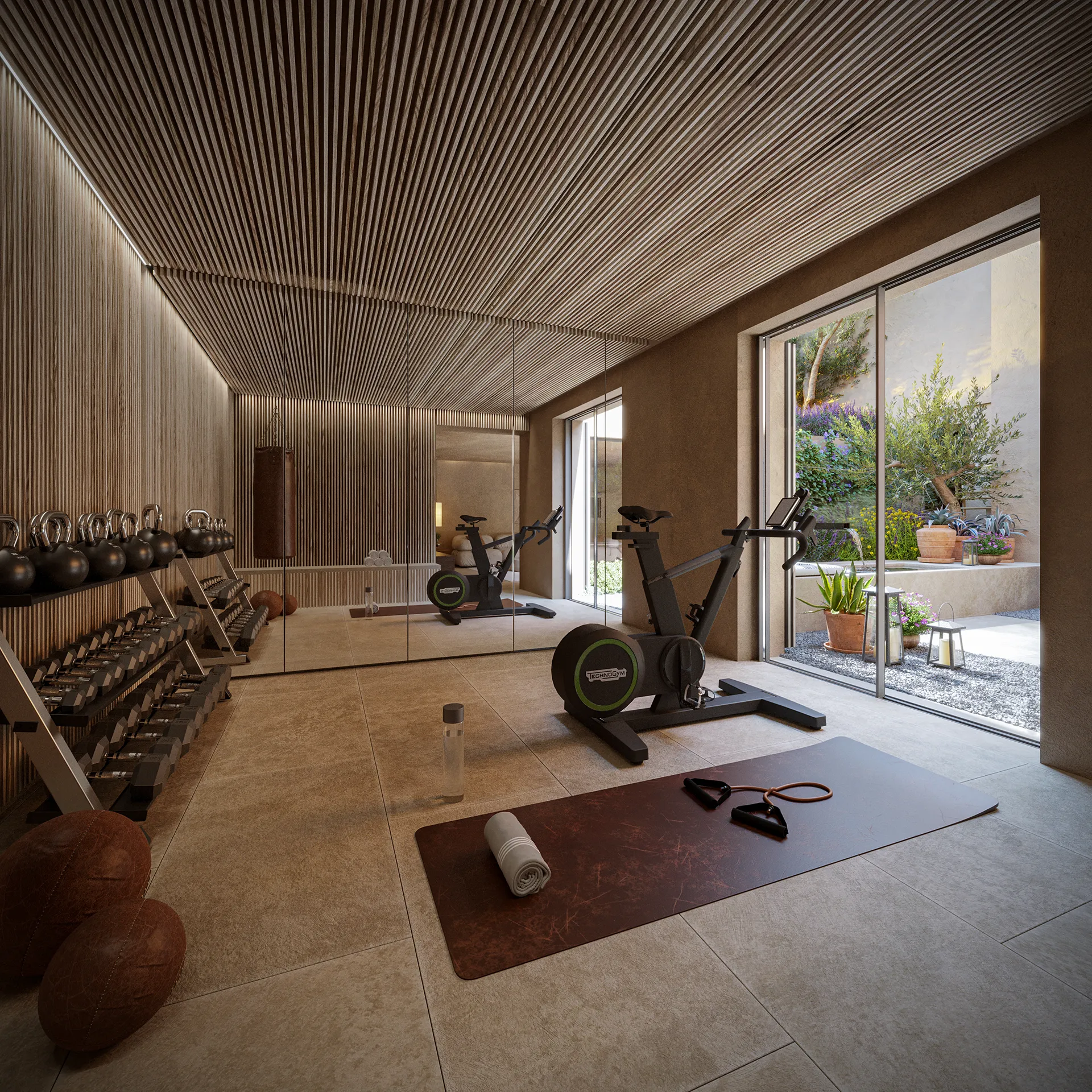
The brochure guides the reader through a series of intimate scenes. Friends arriving at the house and an unforced welcome. Coffee is being made in the kitchen while someone lingers on the terrace. The gesture of stepping barefoot to touch the pool water, glancing around where the boundaries between terrace and garden seamlessly blur. The narrative then expands into the joys of shared life: greetings, a meal falling into place, figs picked for dessert. Eventually, the exterior beckons: a short drive, a pine forest, a timber walkway, and a framed view of the beach.
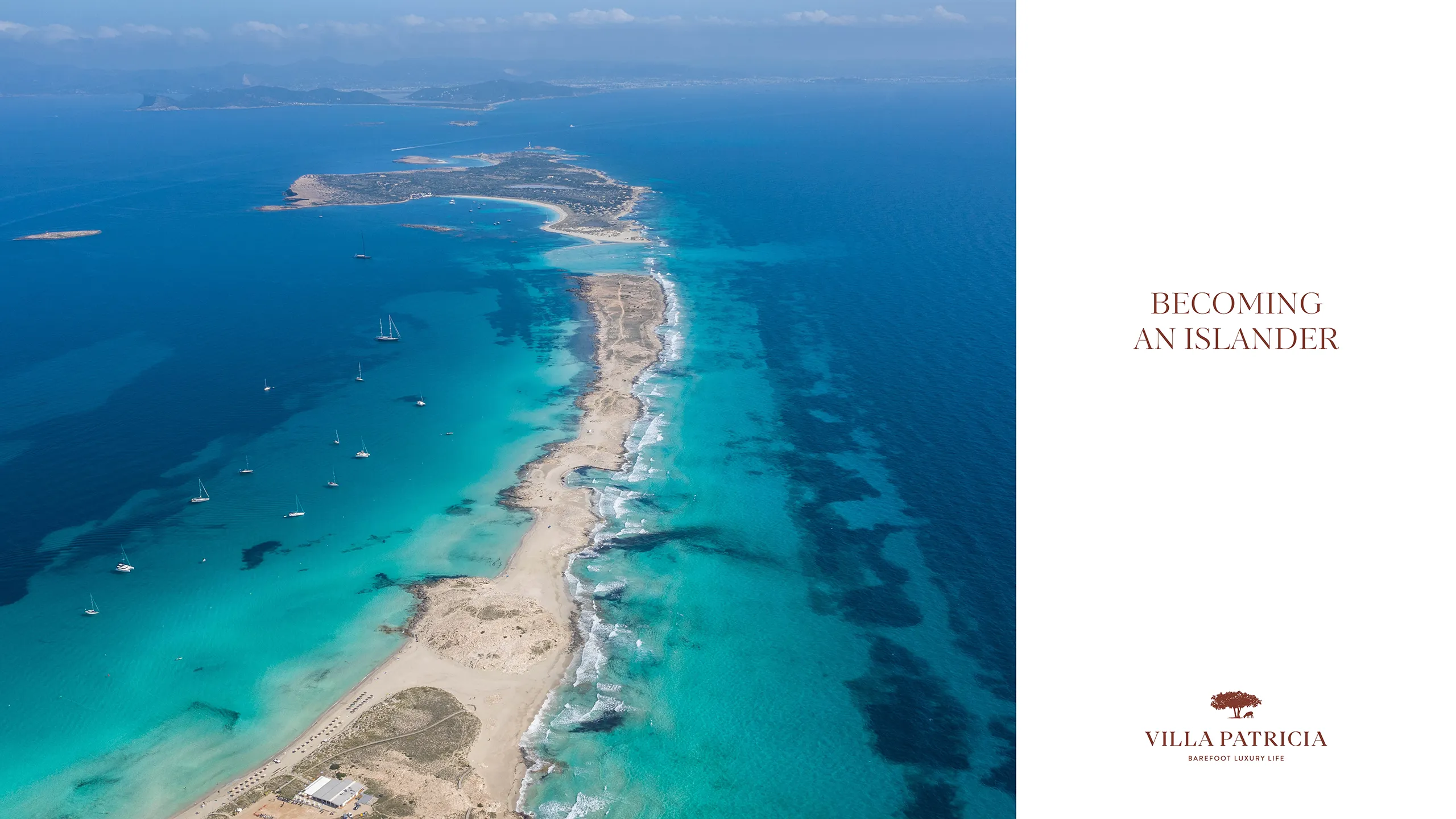
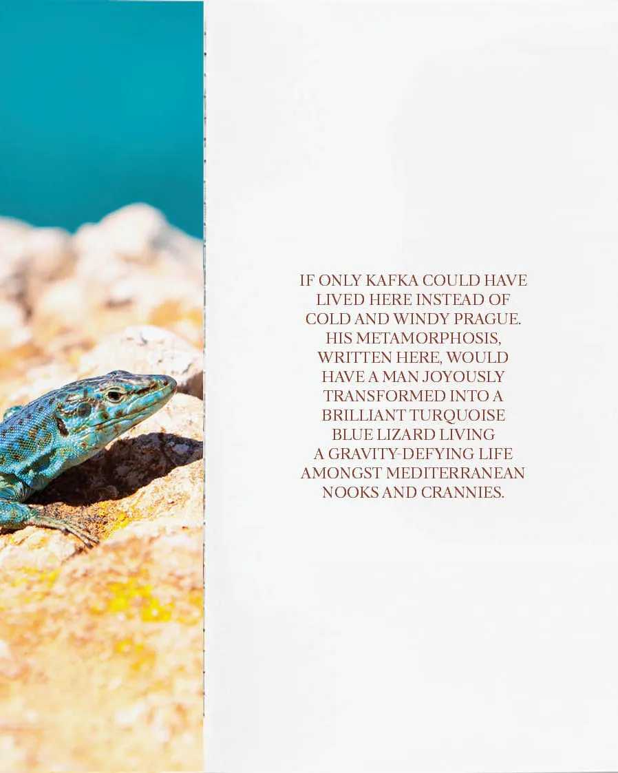
On the following days, the setting shifts from one scene to the next: S’Espalmador, mud bathing, diving above posidonia meadows, the Faro de Barberia lighthouse, and sunsets watched in silence as the sun drops and the air cools. That sequence sustains the concept “Becoming an Islander” and guides the brand system. The colour palette draws directly from the landscape, featuring Azul Formentera alongside a spectrum of earth tones and shadows that mirror the local pine, vine, and fig. Complementing the narrative, the brochure integrates essential property documentation. Plans and technical specifications are presented as a distinct chapter, treated with the same meticulous editorial criteria as the storytelling. This transition allows the reader to move from an emotional experience to a practical understanding of the home’s layout, programme, and dimensions
Log in